Search the Community
Showing results for tags 'logo'.
Found 1 result
-
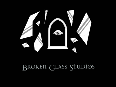
The TDM community and dev team are, of course, not an official developer. The "Broken Glass Studios" moniker used to date is an obvious nod to LGS, and is something of an in-joke, though we've used it fairly consistently over the years. However, the fact that we're a hobbyist dev team doesn't mean we can't have an unofficial logo. Though it's rare for a mod team to have one, I've noticed over the years that some teams occassionally adopted a logo, usually with a simple design. So, here's my very, very rough proposal for one, put together in about a quarter hour yesterday (with some minor tweaks this evening). Shards of glass, from a broken arched window, flying at high speed towards the viewer. A stylised eye peering through the stone window frame, towards the viewer. Why I chose the imagery I did... When Looking Glass Studios had their logo designed in the mid 90s, they wanted it to reflect their name. Famously, the designer mixed up the terms, thinking they meant a spyglass, rather than a looking glass (i.e. mirror). They still liked the provided logo very much, and it simply stuck (and is, to this day, probably the most famous iteration of all their past logos). I originally toyed with the idea of the central object being a stylised looking glass, instead of a window, in a nod to that little design miscommunication of old. I quickly realised it wouldn't look as interesting if part of a logo that's meant to look simple. So I chose the arched window, partly to evoke the sort of historically analogous fantasy world TDM is set in, and partly to evoke a burglary theme. The glass shards are self-explanatory. One visual element I did want to keep as a nod to LGS was the stylised eye. I've used one that is highly similar in shape to the eye from the LGS logo, seen at the end of the spyglass lens. Obviously, this is all just a very rough draft for a logo idea. If you think there might be something to it, but you'd improve it in this or that way, I'm all ears ! Feel free to provide feedback.
- 34 replies
-
- 9
-

-
- broken glass studios
- logo
- (and 2 more)
