

Melan
-
Posts
4467 -
Joined
-
Last visited
-
Days Won
102
Posts posted by Melan
-
-
The shields look nice and much better defined than my original attempt. Will have to try them in practice!
-
-
@Hmart: Also check if you haven't accidentally applied noshadows 1 to your worldspawn (which means all your terrain).
-
It is probably the long sight lines on the street (a typical design mistake, but didn't have time to rethink and rebuild) along with the number of rats roaming around. Still, hopefully nothing outright terrible.
-
Nice! The third picture could use some more work (that wall is a tad unnatural), but the others are interesting.
-
Honestly, I still don't understand caulk. If you build a caulk wall through a room or a street, the two sides are sealed off from each other, but you can look right through the caulk and see the other side, because it gets rendered, but apparently with better performance than sealing the same gap with a visportal?
That's a bit too heavy for me.
-
 1
1
-
-
It is okay to build things in big caulk cubes as a temporary measure (i.e. until you get your different areas up and running), just switch to correctly sealed mission segments as soon as you can. You will find leaks sooner, and will have a lot fewer things to worry about later down the line.
-
Interesting mission. Maybe more choose your own adventure than I usually like my missions, but as a contest entry, it is well rounded and fun.
Based on Exhumed, I expected a total horrorshow, but surprisingly, the successful ending is more Christmas Carrol than "well, time to go and freeze to death, I guess". The story corridors are not too strong on gameplay, but they are definitely scary on the first playthrough. The sneaking portions are well realised, and strong on surreal, otherworldly elements. The things you can see in the mission look good; the minimalistic lighting illuminates just enough to get by, and doesn't illuminate more than it needs to. The moments of disorientation and panic are among the strongest in the mission, even though, technically, nothing is happening.
-
Living statue? Living statues were one of the genuinely cool additions in Thief 3. "Find the sound find the noise find it find it kill it." "Noooothinnnnnng! Nothing and no one and nothing and no one." "Dieeeeeee! Crush and kill and crush and kill."
-
2
-
-
Try
to search the house of the clothier.
-
1
-
-
This is pretty much the kind of mission in size and scope that I expected from the contest! Thanks!
The briefing is very professional, and way above the call of duty. It makes this simple and short mission seem larger than it is. Visually, the place looks good, although it does not live up to the initial impression of the small, rainy side garden. The house interior has a relatively high ambient light level, but few light sources. This makes things look slightly washed out and even. More lights and a lower ambient would have created better contrasts; the rooms which do have lights in them (like the spider lair) look better as a consequence.
The gameplay is exploration with a few surprises (that you could often see coming, although the most effective one might be the things you expect coming, but never arrive). It is fun to sneak through the house, although, as has been noted, the tight corridors make the final escape harder than necessary - a few niches could have helped here.
-
Solid mission for 16 hours of work!
Its appearance is mostly down to the modules, which make the building of common environments very convenient. They were built effectively, and the final result looks attractive. There are some strong touches of audio-visual storytelling, particularly the underground section, which heightens the terror of the mission to a pitch.
The gameplay is good, and things could play out differently on the basis of the order you approach the objectives. As it was, I found the secret door before the skull, so I unintentionally freed Emily before time, and she set out to methodically massacre the household as I snuck off to retrieve the skull. I was still caught by a servant and the guard, and ended the mission in a mad dash for my life.
The horror element is treated efficiently. You know something is up, and the tension builds gradually over exploration. It is this element that places the mission over a standard mansion heist.
Also, I bet myself that Sotha, who always introduced some new technical innovation in every fan mission, could not do so in such a small contest. Proven wrong, again!

-
2
-
-
Sotha: Thanks for the honest feedback! The design decisions you criticise are intentional, although they are of course legitimate to question.
Horror missions which are not just "regular missions but with skeletons and stuff" are about forcing the player into uncomfortable and threatening situations. They benefit from a feeling of weakness (disempowerment) and some amount of frustration. Thief's Return to the Cathedral lets you complete your objectives, then throws curveball after curveball at you when you thought it was all over. The first Penny Dreadful offers multiple apparent ways out of the mission area, but they only draw the player further into dangerous situations. This mission uses the keyhunt element for the same purpose: to keep the player entrapped until they figure the true way out. My regular missions, even if they involve protagonists in precarious situations, tend to have a higher level of empowerment due to offering multiple ways to approach and deal with your targets, thus extending the player's control/mastery of the environment. This is intentionally different.
WRT difficulty, it is a double-edged sword. Earlier versions of the missions were prohibitively difficult, with harsh, overlapping lights in multiple locations, and strong moonlight coverage. This has been toned down after the first playtest version. The question is always whether to make missions for hardcore players (PD2 is one of those), or keep things more approachable, with the occasional difficulty peak. I tend to lean towards the latter, although as a horror mission, it could perhaps have been more unfair. I did fear it would be too much together with the keyhunt part.
The story is intentionally vague. If I had more time to think about the readables, it would be much more vague, impressionistic and surreal. It is not supposed to make 100% logical sense. I have done my job well if the readables and the environment let the player wonder about things and draw their own conclusions (it is interesting to read how people have already interpreted things), but be left with doubts. If anything, things are perhaps too concrete.
That's my reasoning anyway. TL;DR and non-spoilery: this FM is an experiment in designing a horror experience that creates unease, a sense of confinement, and uncertainty in the player.
-
2
-
-
For only four days of building, this is a decent small mission.
There sure are a lot of copypasted corridors, and the patrols are very much on the easy side, but where the mission shines are its inventive touches. The backstory is original, and the customised dead people are individualised by their grave objects. It is this simple device which makes the mission live, and it is surprisingly effective. Coins over the eyes, or objects hinting at their occupation or fate make them seem, well, alive. Then there is the mysterious dining room. I like that it is left unexplained. It is something to think about.
Gameplay-wise, it is mostly routine, with a tight spot here and there. But, again, four days, and I enjoyed playing it.
-
2
-
-
- Popular Post
- Popular Post
By my count (based on this list), there are now 97 separate missions for TDM! This number includes small entries like The Builder's Blocks, but not the blackjack trainer and missions packaged as campaigns. However, if we count +2 missions for No Honour Among Thieves, and +1 for Quinn Co, that makes for 100!
Unless I am making some kind of mistake, which is possible.-
7
-
Oldjim:
You are probably standing on it.
-
It works a bit weirdly. Try using it twice.
-
Clue:
Three people are mentioned in the warning. You should think about visiting their homes one after the other.
-
1
-
-
For the record, I calibrate my normal maps based on a standard I've seen in most other games - a fair chunk of Dark Mod normal maps are rather extreme in the contrast department. But if you want me to hold myself to that standard instead, I guess I can play ball.
It varies from game to game. Thief 3, for example, had normals as deep as the Mariana Trench, much deeper than our textures. Games with parallax mapping go even deeper. We are typically shooting for depth, and we have a stylised look where this depth fits.
-
Two weeks, meaning November 14. Two weeks building time, two weeks judging time... and after that, people will be preoccupied with Beyond Closed Doors anyway.

-
Aaaaand here it goes.
-
- Popular Post
- Popular Post
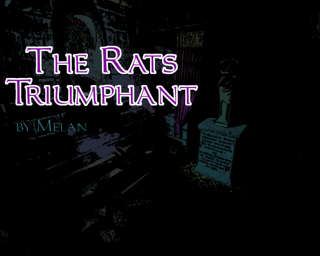
The Rats Triumphant
(Halloween Contest 2015 Mission)
Three weeks ago the Builders condemned Whitechapel Row... They hammered and sawed, and erected their barricades of timber and stone...
Over those weeks, I dreamed of great iron machines that swallowed the sky, thundering and shouting to defy the winds. I dreamed of nitrous vaults undisturbed, forgotten for the counting of years...
At the end of the third week did I awaken in cold sweat, for on that night, I would procure a certain letter from an old house I have not visited in many years...
Jacques Mortegris was his name, and I left him in anger, renouncing my lineage and wealth to live a life of knavery and deceit. But now, I would return for those fever-dreams of gold, and a family inheritance.
Download links:
...and the mission downloader
Design notes:
The idea for this mission came from an old house in a side street where I go to my daily work. It had been dilapidated as long as I can remember, first as a home for beggars and some fairly disreputable people, then condemned and its windows bricked up, and now finally in the process of being demolished. As I went to my work and back, I could watch it disappear day by day, exposing its layers of construction until finally only one wall remained. But for all its ruined state and inhabitants, it had a simple elegance, and I decided to preserve it in the form of a fan mission.
(more on building the mission later)
Special thanks: to Bikerdude for multiple performance-related and aesthetic fixes. My playtersters, Bikerdude (again), nbohr1more and Premier.
-
8
-
grayman: Better late than never! Why this contest matters is that we have a bunch of small missions to play, and because we can show people (again) that it is possible to do missions like these in a small timeframe.

-
In this case, the contrast (is that the depth of the normalmap, right?) would be the thing to change, and not radically (the original normal is kinda shallow as well). But if it is possible, raising the contrast on the brick foundations would be a big thing.
But in the case of a few other textures, the method you use is less rounded than optimal, like it was with the case of blocks_ochre_smooth or old_small_bricks_grey. In both cases, something in the way you generate the normals makes them sharper, but more flat.
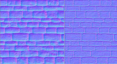
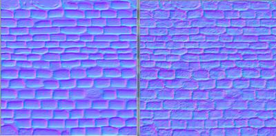
Of course, it is argueable which is better on a case-by-case, texture-by-texture basis. Which is why we are discussing it.
Fan Mission: The Rats Triumphant by Melan (2015/10/31)
in Fan Missions
Posted
Climb one of the great machines and look around a bit.