

Nosslak
-
Posts
679 -
Joined
-
Last visited
-
Days Won
3
Posts posted by Nosslak
-
-
Can't find a screenshot right now, but I still have the map with the crates build in DR.
Yeah, you should show it so that we can judge whether the rejection was just or not.
wine crate and worn (still need shadow meshes-forgot between making them and coming home and uploading)
I think you should add a couple more segments for the rope handles otherwise they look pretty good.
window bars (need skins)

Looks good though I think the bars feel just a little bit too thick right now so if you could scale them down they'd look great.
-
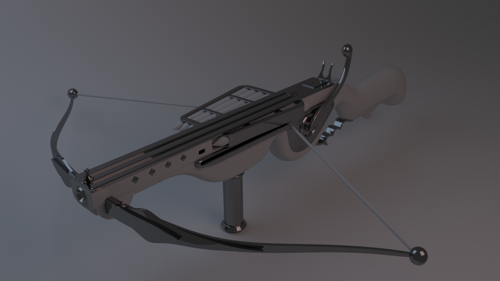
I just supposed it would get reloaded more or less like an
and other modern guns in that you just switch out the whole magazine.I like this design as it's a bit more exotic and more challenging to make than a regular crossbow.
-
WOW! I thought that was a photo - usually I am not so easily fooled by computer art. Just wow.
Thanks! I think it's pretty obviously fake because there's no dirt, imperfections and the liquid isn't particularly realistic either IMO, but it's easier for the artist to see those things I suppose.
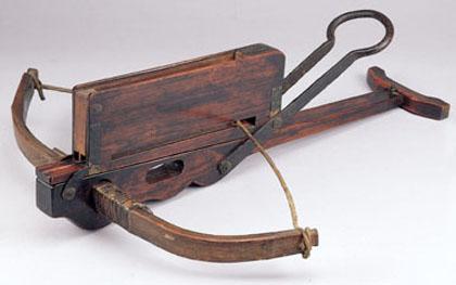
That looks like a toy gun compared to ours.

Maybe but it'll be a great reference for some extra details anyway so thank you, Tels, for the link.
-
Well, to play devil's advocate. That lever could be a ratchet, or just a one pull pump. It doesn't have to be a wind-up.
Yeah, I guess it could, but I think it makes the silhouette a bit richer and makes the weapon look a bit more exotic, so I'd prefer to keep it.
It might looks a bit high tech atm, but it looks like plastic and smoked chrome in the render. I thik in wood brass and dirt it's going to look very steampunk.I were going to make those materials and were just going to make a little test-render with Cycles with it as I haven't used it so much (this is my second project that I've used cycles, here the first, you might recognize it) but it turned out so good that I decided to post it. Making good materials with Cycles is pretty hard IMO so I just went with the default metal and a basic clay material.
As far as the wishbones up front, whther or not it's the best 'realistic mechanical advantage' or not. It will look better from players perspective with them outside.Yeah that's what I thought too.
-
Mmm.. Most excellent. Is that gonna be AI useable in-game? Elite crossbow archers with repeating crossbows!
that's fantastic!
Inspiring stuff goes on here
 Great works!
Looks great! I had these in mind for builders, who never seemed quite right to me with a bow.
Thanks a lot, everybody!
My jaw literally dropped on seeing that <3 <3 <3
Thanks! I'm using Blenders new Cycles render engine so that's part of why it looks so good (that and excellent modeling). It is a physically correct engine that takes a rather long time to render the models so I'm sorry but the final result won't look as good in-game.
Well, to be honest I didn't like the handle part. I have never seen something like that before in medieval crossbows. It doesn't look like steampunk either. It just looks modern to me. Am I the only one on that?Yeah, I'm very unsure about it myself too. It looks cool on the concept but I don't think it really works in 3D. I'll probably skip it for the next update.
Looks cool indeed.
But there are three problems with the function: first you couldnt rotate the crank when the sinew is nearly at the ent (thatswhy historical crossbows use the crank on top or at the end of the shaft)
and second the shorter bows have to be behind the long ones, so u can use also theyr power for the shot. Also they can be tied to the longer ones but that is a higher risk for mechanical break down.
and the magazine should also be on top (http://www.arrowmani...ng-crossbow.jpg). I mean yes it is possible in this way but the complex mechanism for this is a bit "overpowered" for a steampunk world isnt it ?
Yeah, I'm no history buff so I didn't really think about any of those things. I'm not really sure if I can address those problems without some major redesigns that would make it look a lot less cool, so I'm not sure I'll actually deal with them. All I really did was follow the concept art as I assumed that it'd be a somewhat plausible design.
Please dont see this as a hard critisism...i see this only from the point of a historical interested engineer and not as a gamer.
Yeah, I don't mind some constructive criticism, quite the opposite actually as it helps me make better models. I don't think I'll change the design to make it more realistic though because I don't think anyone would really notice it in-game and as I said it'd take some major redesigning. Thanks for the critique anyway!
-
Marmoset for lowpolys. Cycles for highpolys. Bi-WINNING!
Wow, Noss. Too cool, man. Too cool.

Yeah, thanks a lot!
-
 1
1
-
-
Thanks!
Nearly done:
Just need to add some details to the curves at the front and the handle at the back.
-
TDM does have a pretty good basic brass texture too, textures/darkmod/metal/flat/brass_greenish_tiling. Works pretty well for skinning statues and stuff too, with an AO blend + bump, should work for pipes and other prefab stuff.
Yeah, I don't know how good the stock texture is (haven't played a lot of FMs) but if you want I could export mine as as a separate texture too.
But as always, Noss your low poly stuff is lovely
If you ever get bored, you could try reuse the textures and tile the table to make a set, a version like endtable1.lwo would be awesome too... but it's always easy talking about other peoples work, I know I know
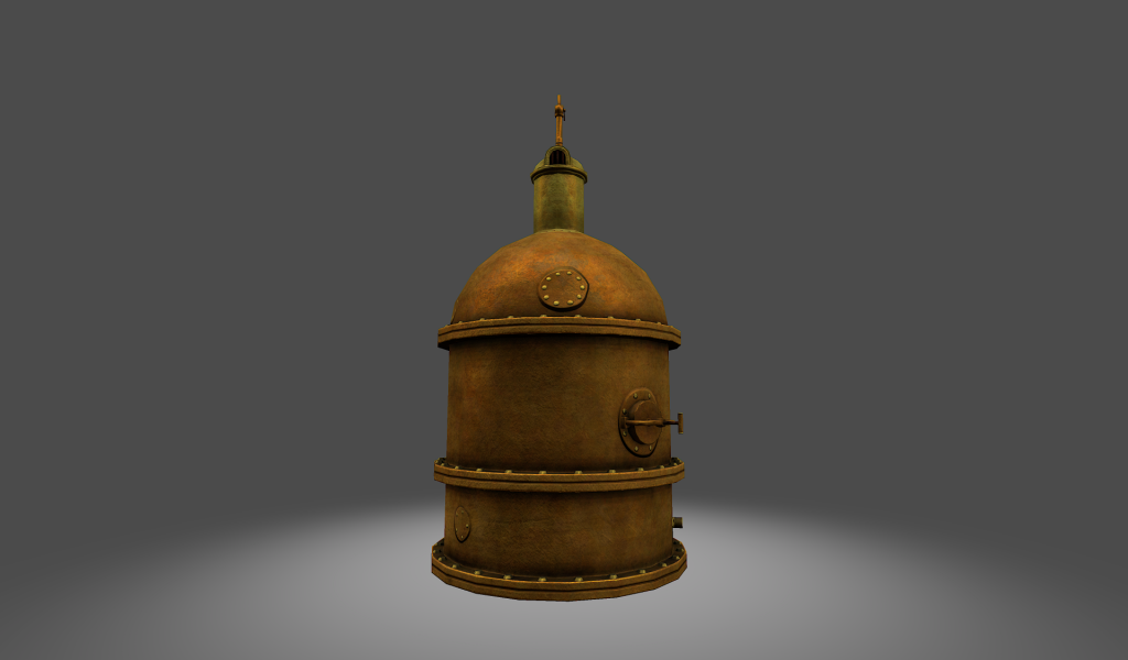
Or a set of pipes and stuff from that boiler material...Yeah, I could pretty easily convert it to a design like that. I'd just have to remove one leg and scale part of the mesh. So yeah, I can try to do that. Pipes aren't challenging to make and I'm not sure what dimensions to make them in or anything so it'd probably be better if someone else made those.
-
Your work is stunning N, keep it up! <3
Thanks!
Thats some awesome work! I too find that I work 200% more if Im kept from the internet haha, Im always looking up stuff if I have access... I like the changes/simplification to the table, and all the metal work lloks fantastic, just the right feel, proportion, and amount of detail. Very nice...
Damn I wish I could make such nice metal texture...
Yeah, thanks. Here's the tutorial that I learned from:
http://cg.tutsplus.c...metal-textures/
There's not all that much to it really. I've just laid several layers of grunge and scratch textures and brushes over each other to make the base-texture and then just repeated that texture all over my texture map and overlaid that with some grunge and scratch textures again. The trick to really sell metal is to make the diffuse (color) texture pretty dark, with a very bright and contrasted specular map with a lot of dirt and scratches as unique details for the specular map. When I make my brass/copper work I make the diffuse yellow/greenish and then the specular more orange/redish. When you make your specular map you should keep n mind that if the material in question is a conductor (leads electricity e.g metal) the specularity should have kind of the same color as the diffuse, but if it's non-conductive (e.g wood) the specularity/reflection should be white. There is a scientific reason for it that I read in an article a while ago but I can't remember it.
-
I posted so much stuff yesterday that I forgot about one of my improved models:
-
1
-
-
Looks good Noss, needs a better wood with grain texture though.
Yeah, that was just the untextured highpoly. I'm almost finished with the lowpoly I just need to redo those side details as they were kind of fugly when I tried the old design with alpha maps.
-
Yep, very nice indeed.
what he said!
Thanks!
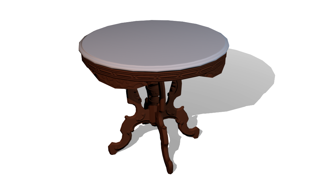
I had no internet for a few days so without Youtube and all that other crap to steal my attention I got to work on some of my models. First I reworked the tables sides a little bit (old one for comparison) so they wouldn't need alphas as that didn't work out as good as I hoped:
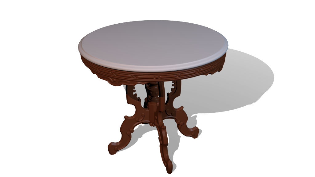
Not really sure what I think about the new side-details. What do you think about it?
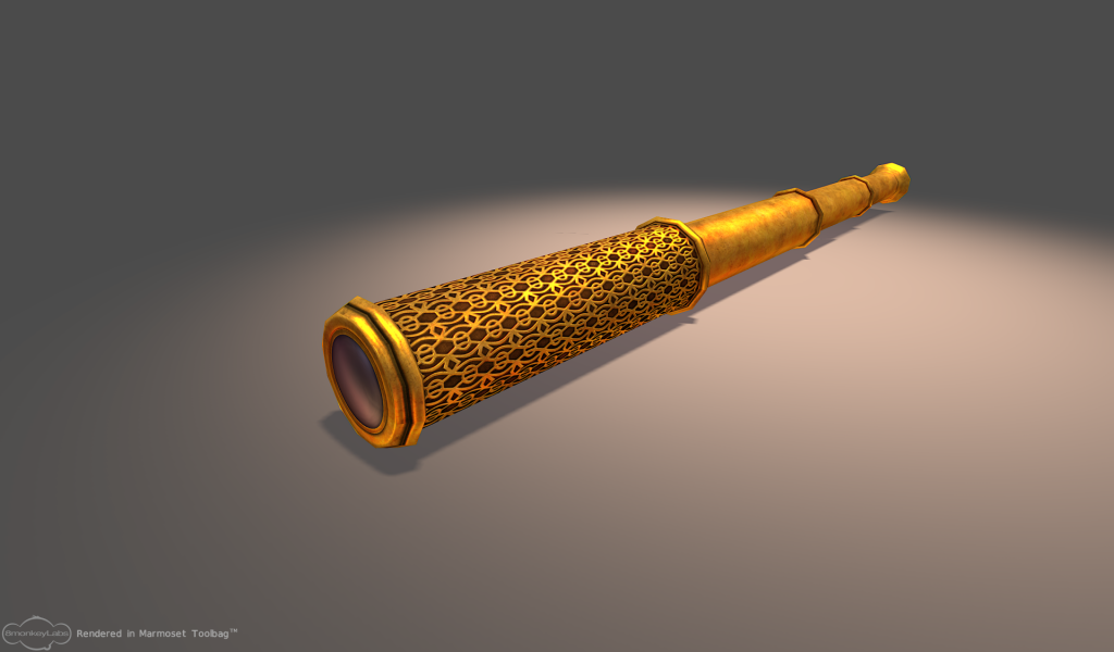
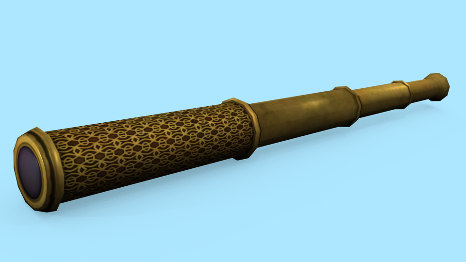
I also polished up my old spyglass to fit my newer quality standards:
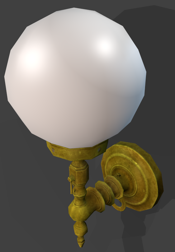
I also remade the texture for my old lampmodel:
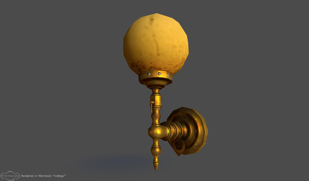
The bulbs glass texture is imo way too lowres, has blurry details, has a 1px white border, too yellow (there should be a white/blue-ish one for electrical light imo) and tbh is just generally bad. Maybe someone can make a new texture for lampglass?
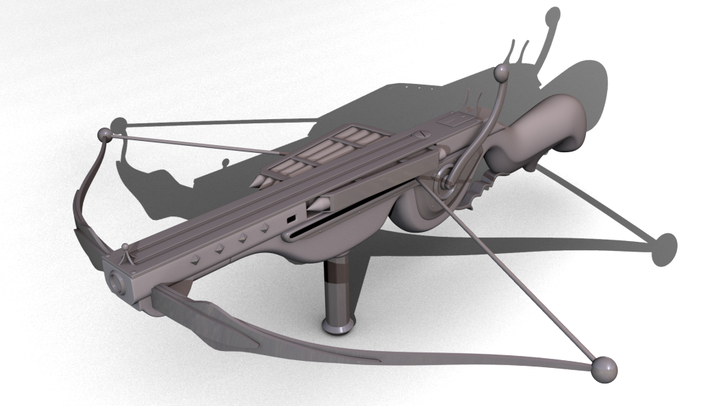
I also started working on Springheels crossbow:
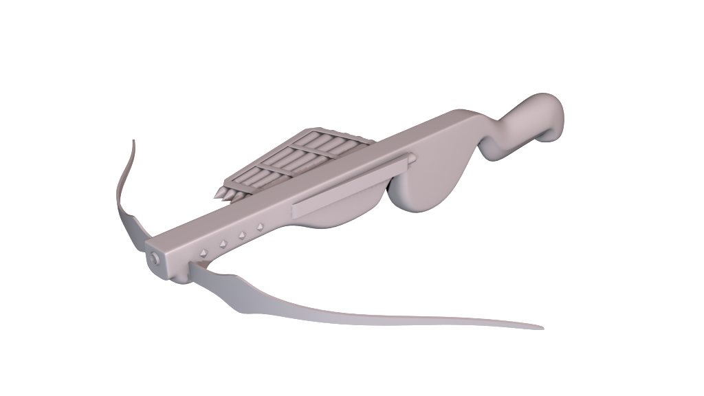
It's far from done as I'm sure you can tell.
Julio is still working on the zombie concept so I haven't started modeling that yet.
I guess I ought to lose my internet more often.
-
1
-
-
I haven't used any of these programs but couldn't you just generate terrain with Bryce and import it into an optimization tool (Blender has a Decimation modifier if nothing else but it's not very good), then just export it to Blender or whatever to do vertex colors and export it for D3? It might not result in as good/optimized terrain as if you'd model everything by hand but it shouldn't require much time/skill.
-
Thanks, here's a less detailed version:

Looking good, but the metal parts don't really read well as metal. I think you should add some specularity to them (not too much though) and maybe also try to differentiate the metal strips from the underlying plate (you could do that with added grunge, changing the colors of either one, adding rust, etc), Also I think you can afford an additional loop for both of the top stones as it looks a little bit too lowpoly.
-
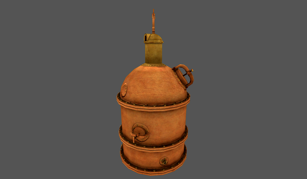
The alembic and tree models are both up on SVN and will be available in 1.08.
Nice, thanks!
I'm still messing about with my new exporter, its so damn close - but for some reason doom3 hates the UV co-ords... but soon as it's done, you'll have it.
Thank you too, Serps!
Quick normal bake test before school:
I think it turned out great (no alpha yet though)!
-
1
-
-
Noss, I like many other appreciate your hard work, and most dont have half your skills, but may i make a suggestion if it hasent been done already..
Is it not possible to replace some fo the poly detail, with normal map textures, thereby reducing the poly count..? eg the details along the edge of the table or the flats sides of the legs..?
Some of the details are replaceable with normalmaps, but the thing is that normalmaps can only really simulate concave details (details pointing inwards) really good as they won't change the silhouette. Also normalmaps can't simulate 90 degree angles in a satisfying way either, so they are pretty limited to be honest. I have a pretty curved silhouette so that will need a lot of polys. The detail at the top of the legs will be simulated with alphamapped planes though instead of actual geometry (the downside with this is that if they're viewed at an extreme angle you can see that there is no width to them).
And I know I have asked this before, but where are all your models stored so we can start using them in maps..
Most of them should be available already but here's some of the one's that I haven't uploaded:
- Alembic (I think Springheel or someone were going to make a shadowmesh for, maybe 1.08)
- Barrel (need materials and all that jazz)
- Bed (basically finished with material and all, should just need to upload it)
- Cart (need to make materials, CM and SM)
- Clock (CM, SM and materials again)
- Walllamp (had some trouble finding a suitable glass texture otherwise finished)
- Lamppost (not satisfied with the quality, so I won't upload it)
- Royal orb (had some baking troubles, but they're solved so I can finish it now)
- Tree (CM and SM is being worked on by Springheel I think)
I'm a modeller and that is what I signed up for and want to do, that is why some of the other stuff takes time. If you're wondering about any model in particular I can probably find it for you.
Well, even if you'r only saving 50 tris by making the shadow legs triangular that's a pretty good saving and I doubt it would really show much in the shadow. And that's where the performance matters.I'd do the point of the tri at the bottom/inside though.
Alright, I'll do it then. It was the inside edges that I collapsed before.
-
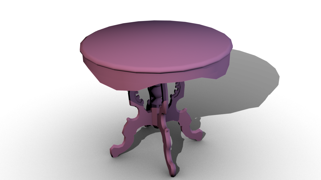
oooh very nice table Noss...
I really

craftsmanship on the table is exquisite!
Thanks!
I managed to cut down the polys a bit further:
- Visible mesh is now at about 1700 polys (25% less)
- Shadow mesh is at about 740 polys (about 20% less). Making the legs triangular didn't even save 100 polys so I skipped that.
- Also made a collision mesh with about 500 triangles.
-
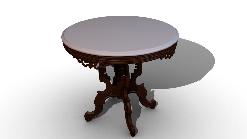
900 might be a bit heavy....would be good to trim down if you can but I wouldn't discount the model because of that.
But, it looks great, and most likely it's one of those one per scene objects. How are you doing the shadows for the legs? Triangluar? flatplanes? I'd think with flatplanes a really rough shadow (kindof mentally drawing it out here) could be as low as 320 tris. The a decent round for the top, probably under 600.
Maybe you could do an LOD which is nothing more than shadow mesh changes.
The LOD idea does sound pretty good in theory but I don't know how useful it'd be in practice as this table belongs inside where there are no really long drawdistances where it'd be suitable. The legs for the shadows are currently box-based but cutting them down to a being triangle-based would probably be good.
That's more than double any of our current tables, so it would be good to reduce it a bit. Looks good though.
Just to be clear that was the highpoly version (added a clarification in the original post too). I'm not sure where to reduce it as I've done that a bit already. I guess I could replace some of the ornaments on the legs (near the top) with planes as I am planning to do for the ornaments hanging down from the wooden circle under the table surface but otherwise I can't do much without worsening the quality. Here's how the lowpoly looks:
-
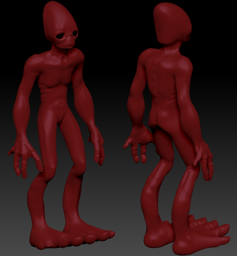
That alien looks really good though, particularly for a first exercise. I really like the hands and feet, very well detailed and interesting/realistic anatomy.
Thanks! It's based on the mudokons from the Oddworld games.
I was a little bored yesterday and felt that I sure could use some kind of pedestal to present my models better on which resulted in this highpoly:
Took about 2-3 hours to model. I'm having some problems making suitably low poly lowpoly mesh, as it has a pretty distinct silhouette. Right now the lowpoly is at about 2300 and the shadow at maybe 900 triangles or so. Is this too much?
I know I should probably finish up the masks but they're almost done and I'm easily distracted. Julio is helping me with a zombie concept so I can't start that just yet either.
-
1
-
-
I played it a while ago and I think it's pretty awesome!
-
@ Nosslak - I know exactly what you mean, nice to know that you kept at it, it was worth it! The thing with subdivision is that it's good for creating complex shapes and aproximations, but only solid models and "water tight" surface models are actualy meant to be used for serious technical modeling, so its hard to spend time learning them.
Alright, thanks for clarifying, but that's not at all what it's like working with curves in Blender. Here's a video showing blenders curves (old interface though, so it's a bit easier now):
http://cgcookie.com/blender/2009/05/20/modeling-with-curves/
You can also deform other meshes along curves and this is what I usually do to wrap complex patterns around my models.
Anyways, have fun with the zombie, would you say humanoid shapes are easier to do in zbrush, instead of building them face by face?Thanks, I haven't used ZBrush all that much (I've done maybe 3 models with it, no ZSpheres yet) but I'd say that for me it's easiest to make a base-mesh in Blender without any real detail but with good topology (edge-flow) that follows the anatomy which makes it easy to add details and then sculpt muscles, bones and such in Zbrush. Here's the third and latest model I've made with Zbrush (and Blender for the base-mesh):
Sorry for the shitty render, it's just an old screenshot that were already up on photobucket.
I haven't thought about what I'd like to do after the current FM I'm working on. But now that you mention it, I'd love to do a masquerade FM. it would be great if you could put a mask on and the AI wouldn't attack you. Like in Hitman when you wear a disguise. Although that would be limited to the ball room. Caught any where else in the building and they get suspicious.
I forgot to ask earlier, but if you're going to make a masquerade FM when would you need the male mask?
-
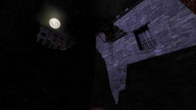
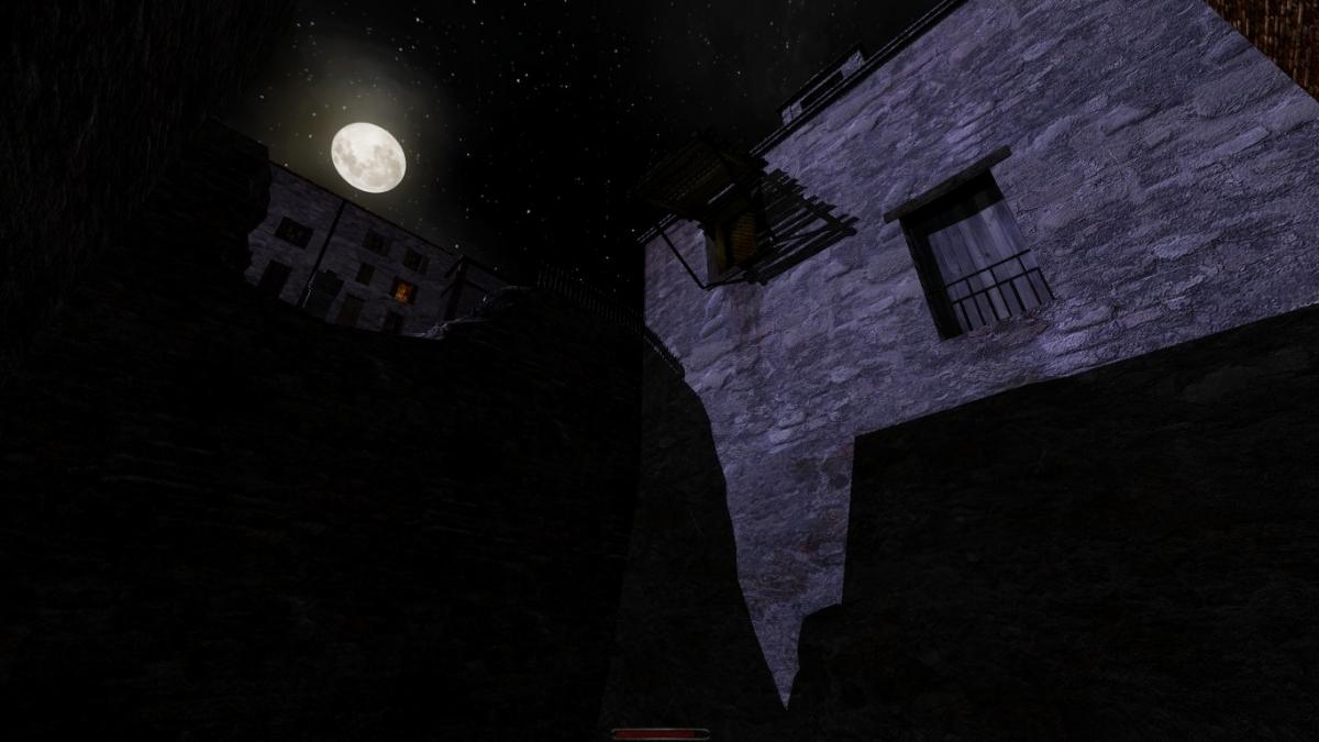
Here's a very non-revealling pic of my first map, it shows the use of moonlight to create dramatic shadows over the game world and make it pretty hard for the player to cruise around protected by continuous darkness. This area in particular is still going to be decorated (mainly vegetation, it's an abandoned back patio), but at least it's a peak into how the project is striving to look. The point was to create a somewhat realistic looking world, with more of a gothic/medieval feel to it than the victorian/steampunk visuals that is usually associated with Thief or TDM. Beware that the light levels are still bright, for testing purpouses, it should be dimmer on release. Good news is that the ambient light + constant moonlight + scattered lights combination (apart from the decent complexity of many buildings and rooms, and some big open areas) are not registering a very big impact on my play tests so far. Since a lot of decoration is still missing, say around 50-60%) and also some AI (so far I've placed around 60% of them, without paths yet), my fingers are crossed I wont run into any major performance issues - my laptop is medium to low range by now (was good back in 2009), so if I can make it run normally on mine, most people will also be able to.
PS: Im looking for info on how to rotate the Moon position hehe - as the default skybox renders it to your east, and my parallel light comes from north-east.

The pic seems to have lost quite a bit of quality on upload... Does the forum also compact images when attaching?
Looks good, but you should add a trim around that balcony/window/thingy.
-
No, it doesn't. But 154 polies vs. 300 for the mask does make a difference - esp. if you have a ballroom full of AI. And if that takes the modeller one hour, I think that is an hour well spent. I agree tho that wittling it down further is not economical.
Actually, the mask itself is the only thing that I've optimized and I just removed 34 polys (about 18 percent). Optimizing away 18 percent of a mesh without degrading the visual quality is probably a pretty good exercise but to be honest the original mesh was pretty flawed and could need a little clean-up even though it might not matter much in-game.
@Nosslak: the low poly looks fantastic I bet from 5m away nobody will see a difference. Can't wait to try it in game.Yeah, thanks! Many of the polys for the regular version were there to prevent clipping and as I couldn't spend all that many on this it will be offset a little bit from the face so there might be some popping if changed when the player is too close.
Damn, just noticed those little welding details on the metal, amazing attention! Is the whole model done with splines Nosslak? Working with (sp)lines and surfaces (nurbs) is the main reason why I cant get myself to learn subdivision programs, I wonder which ones you use to come up with all these good looking models?
Thanks! I use Blender, Photoshop, xNormal (generates normal- and AO maps) and ZBrush (only for the plague doctor mask so far) to make my models. I'm not really sure of the terminology outside of poly-modeling but for the design above with the LOD-mesh I used bezier curves which I think might be a kind of spline and the white surface was just regular old polygons with subdivision surfaces (smoothing). For most of my models I do use curves, on some models (like this) to convert to polys and bake to maps or to deform my geometry, but you can make good models without them if you want to. I've never used nurbs so I can't comment on that, though AFAIK it is basically the same as subdivision surfaces so I don't see any reason to use them.
Trying to learn modeling is hard (at least with Blender as your first program) but when I was 13-14 ish (6-7 years ago) I wanted to learn how to make my own games, which led me to making real-time graphics so I tried to find a suitable tool for modeling and eventually landed on Blenders site. I installed Blender and had a horrible time, until I learned to love it by sitting several hours every day with it until I felt comfortable with it (I was very mtivated). So yeah, learning a 3D software for the first time is hard work but (at least Blender) have gotten easier since then with a revamped interface and lots of good tutorials. Being able to model as good models (IMO) as I have done for this mod is hard, but so very, very rewarding that it makes it all worth it.
-
This modelling by committee is fascinating. If you really enjoy spending your time cutting down polys, then more power to you. But don't be mislead into thinking that 28 non-shadowcasting polys actually makes a wit of difference to the engine.
Yeah, you're probably right but I think every modeler should learn to properly optimize their models. I don't think I can optimize it any more without sacrificing the quality or making it clip into the face though so I'm just going to stop right here.
So, what are you working on right now?
in TDM Editors Guild
Posted
Why are you making them with DR anyways? I've barely used DR but to to me it feels like a modeling app would be a lot faster and grant you more control.