

Springheel
-
Posts
37683 -
Joined
-
Last visited
-
Days Won
357
Posts posted by Springheel
-
-
Well I've run that before to calibrate my monitor and PS5.5, but I don't want to change the way my monitor looks, or any other application for that matter. PS7 seems to be using a different series of settings from everything else, and I'm not sure where they're coming from.
-
Sure, just let me know which ones you'd like me to do. I have some extra time this week so it shouldn't be a problem.
BTW, did you get my PM about texturing objects? I can't see it in my sent folder, but I was sure I sent you one.
-
Unlike 5.5 there is no colour calibration wizard in photoshop 7.
That's ok, this option wasn't in the wizard anyway. It was under the RGB colour calibration menu.
The problem is that PS seems to want to make the gamma higher on everything. In PS5.5, telling it not to compensate for the monitor worked. But I can't find the similar option in PS7. Seeing as I don't know what PS7 is doing to make everything brighter, I don't really know how to make things look the way they are supposed to. But I can pull the same image up in both PS5.5 and 7, and side by side you can see 7 is much brighter.
-
Ok, well you'll have to talk to Ren about that. He's the door expert.
-
Well, we haven't got anything textured yet. Still working on it. What about a door?
-
I decided to finally get with the times and updated my PS5.5 to PS7. I've been having a bit of a problem though. The gamma when I have PS7 open is higher than everything else on my monitor, so that when I view images in other applications, they are much darker.
I had this problem with 5.5 at one point too, and fixed it by going into RGB colour management and clicking off the "Use Monitor Compensation" box (or something close to that; I forget the exact wording.
I can't find any such option in PS7 though. Anyone know where I would find that option, or something like it?
-
Oooo, purdy.

-
On the subject of arrows, can the crystal tips take on a slightly tighter, pointier, knapped flint style. Something about them as is suggests that they won't fly to well in an unbalanced
I was actually thinking they were TOO pointed. They certainly are more aerodynamic than either of the two crystal sytles in the original games. I wouldn't change them.
Re: the compound bow...you're right, it isn't really necessary, so let's just go with a recurve bow. Something on the small side, like a meter high or so.
-
I've added a blank frame to the ftp site so people can easily make their own painting textures.
-
Yeah, and why do they use swords? If they are dead Hammerites, shouldn't they be using hammers?
-
DO, can you post a picture of just the sword? I'd like a copy for the Approved Model thread.
-
Here's a pic of some bows...I had been thinking of a recurve bow, but hell, it's steampunk, couldn't he have some kind of compound bow? What do you think?

-
Yep. good job, DO!
-
He knows, NH.

-
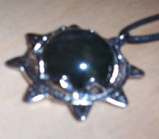

Use the above as reference. You will have to extend the four cardinal points so that they can be more easily seen above the gem.
-
Actually, Oofnish, would you be up for modelling the lightgem? We need something to texture so we can start looking at it in game. The thread with the reference material is already created. If you'd rather not let me know and I'll assign it to someone else.
-
it's just the general concept you should be thinking about
Well, we do HAVE a concept piece already approved for the Builder guards. Not that I think it's the best of the lot, but we aren't starting from scratch here. Make some modifications as you see fit, but don't stray too far from what's there.

-
Ok, so we need one of our modellers to create a lightgem then? I'll appoint someone.
-
Domarius, if it doesn't use a model, will it still look 3d? I'm thinking of the way the compass looked in T1/2, and T3 for that matter. Perspective was at work so the part further away from you was smaller. Can we achieve that with a bitmap?
-
Not at the moment, no. When I get home I can send you some reference pics. How about a broadhead while you're doing arrows?
-
Maybe we should do a model gallery where we can see everything together. I have some doubts that all the models are very different in style depending on the creator.
Well, seeing as we only have 2 models and 1 completed model, your doubts might be a little premature....? I agree using oDDity's models as a base would be a good idea for future models though.
oDDity: In what way do you think we are going too much down the T3 path? I have used T1/2 almost exclusively for reference and inspiration.
-
So instead of a user-interfaced purchasing system, is there any reason we can't do a variation on the thief 3 method?
Gah! Omega, check out the 2 page discussion on this very issue:
http://forums.thedarkmod.com/index.php?showtopic=43
We came up with a number of reasons why this might not be feasible and/or fun.

-
Sort of like a template that people can add to their own maps? That would be fine. I don't think it should be integrated into the system in any other way though, for reasons already discussed in the previous thread.
-
Great! Could you take look here http://forums.thedarkmod.com/index.php?act=ST&f=3&t=285
and assign or create some concepts for the other screens as well?
I have some ideas of how this could work...a similar look to each menu, but the central design could be different for each page, or different figures at the sides, or something. I won't have time to do anything tonight, but I'll play around with some ideas on the weekend.
Texture Organization
in Art Assets
Posted
Excellent! So, can we start asking ourselves what kind of textures we need next? Are we trying to finish off one 'theme' at a time? We could create an infinite number of mansion textures, I'm sure, but do we have enough that we should start asking, "what do we need that we don't already have?"
Also, should we be adding model textures to the list of things we need to make? I notice it isn't up there at the moment.