

Springheel
-
Posts
37683 -
Joined
-
Last visited
-
Days Won
358
Posts posted by Springheel
-
-
god_is_my_goldfish, please post all art and comments related to noise arrows in this thread.
-
Monitors do not display anything higher than 72dpi. Anything higher than that is only useful if you are printing them out. On a monitor, it just makes it appear larger.
-
Characters and related
Townsfolk:
- Whores
- Nobleman
Builders:
Pagans:
Inventors:
Magical:
---------
Props
- Machines
---------
Environments
- City Reference Pictures (lots)
- Mansion Interior with Fountain
- The Slough (flooded district)
---------
Weapons / Equipment
---------
Gameplay Stuff
- Scrolls and Readables parchment
Floorplans
City and House concepts
- City
---------
Campaign Stuff
-
 1
1
-
-
I've done a redline to suggest some modifications to the leg.
.jpg)
Also, can we keep the concept art at 72 dpi? This picture is absolutely huge...24.4M in photoshop! This kind of rough drawing only needs to be 72 dpi and a maximum of about 800px wide.
-
Not quite understanding what you mean, care to elaborate?
The back legs have a single joint that bends backwards, making it unclear exactly how they would walk. Their forelegs don't look terribly useful in that regard. Adding another joint at the top or bottom of the leg might help. Take a look at some reference pics...a Trex might be useful or the back leg of a deer.
-
How's this? I took out some of the stripes.
-
I don't think the stripes look bad at all, but I'm more for giving them a homegenous look so that you can classify them as being a part of the same faction.
That's what the colour and symbol is for.
 Not to mention the hammer. I don't think anyone would fail to see the resemblance.
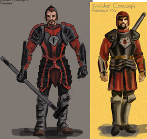
(of course it would help if they both had the same symbol...still experimenting with that.)
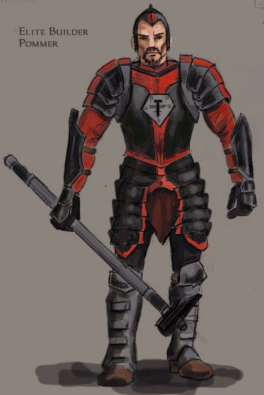
My view of the elite guards is that they would be Builders who had been with the church for many, many years, doing great work and training hard. They are now second only to the high priests in their piety and power. Their armour serves both a practical AND ceremonial purpose. It should be more ornate than the regular temple guards.
Keep in mind that the colouring job is a little comic-bookish at the moment...they probably shouldn't be that bright.
-
I don't know, I like the stripes. They make him look a little more ceremonial, a little more polished, and a little more dangerous. Changing it to solid colours makes him look very similar to the normal guard version. It was the decorative nature of the stripes that attracted me to the armour in the first place. As I said elsewhere, painting armour was quite common, historically.
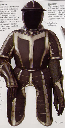
Here's the original picture I used as a reference.
-
I always thought Burricks were kind of cute in the original. Especially the way they whimpered when you hit them. This concept is looking good, but take a closer look at the back legs...they look a little strange, like they need another joint or something.
-
Coloured armour was quite common. The reference pic was black and silver...I'll post it when I'm home from work.
-
Here is a coloured version of our elite builder guards. I've replaced the chain mail here too. I'm not happy with the hammer, but we'll work on the weapons later. This is actually based on a historical set of armour I found pictures of. Very cool.
-
I don't think that all Builders should have goatees.
Fair enough. Variety is better. But how many different heads will we model?
-
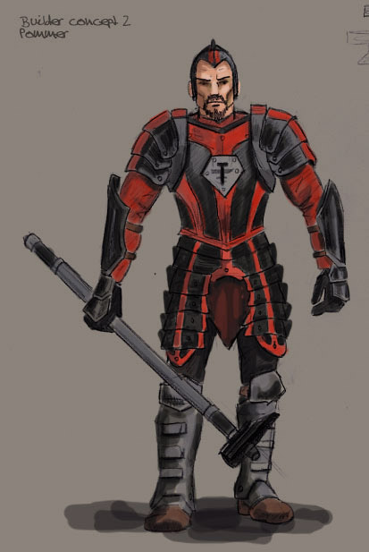
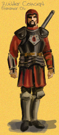
Taking some feedback from Alexius and Blackthief, I have made some changes to the Builder Guard concept.
I have gotten rid of the chain mail...since Builders are so fond of metal, I decided their armour should be heavy plates, not flexible mail. I'll save mail for the city guards.
I added shoulder plates so they can heft their hammers, and replaced the helmet with a skullcap.
I also think all Builders should have goatees, giving them a slight spanish look. I have always thought of the Spanish Inquisition when I think of them. Hard, dogmatic, etc.
-
I also have some original artwork that I will provide the team for use in paintings. Mostly landscapes and that kind of thing, as well as some portraits.
-
You raise a good point Sparhawk. Fewer people will be reading all of the threads. I'll volunteer to scan the art threads and post or PM to you any agreements that have been made.
-
Please post all comments and concept art for the Belchers in this thread.
-
I have made threads for both Darkness Fall's craymen idea and god is my goldfish's Belcher concept. Please post anything regarding those projects in those threads only.
-
Darkness Falls will be working on creating a creature to fill the roll of Craymen/Kurshok. That is, a mysterious humamoid race to populate deep out of the way caverns or pagan areas. I would prefer leaning more towards the craymen than the Kurshok.
DF, post any and all work related to this project in this thread, please.
-
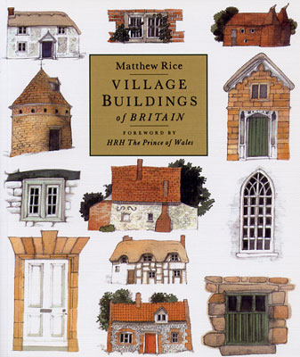
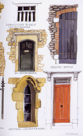
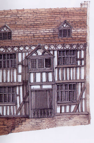
I got a great book for Christmas last year. It's called "Village Buildings of Britain" by Matthew Rice. It is full of illustrations of different buildings, doors, windows, etc from places around Britain. Lots of stuff we could use. I don't want to break the spine, but here are a few example pages:
-
Nice job.
-
I think you need to raise the nose and mouth a little bit. At the moment the face has very little chin, and the nose seems extra long. Here's a touchup to illustrate.
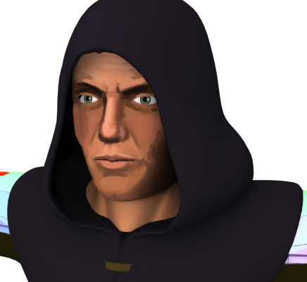
I also thinned out the top lip a bit and gave him a more prominent browridge. I also made his cheekbones stand out just a bit more.
Edit: After looking at this some more, I think I would raise the mouth up just a bit higher.
Edit again: Ok, I've raised the mouth and made the bottom lip a little less wide.
-
after people have volunteered.
Well that's the key, isn't it? I can't do that until I get volunteers, which was the point of the message.
-
I didn't think much of them either, although there WERE medeival doors with locks in the center. I'd prefer we stuck to the lock by the door. Our animation team will have to take a look at how that will work, of course. Actually, if we use the T3 style lockpicking mode, then we could pick locks at virutally any level. We wouldn't have to worry too much about clipping if we don't use 3rd person view.
-
Yeah, he really doesn't need to know anything specific...we'd probably just need the graphic image. I suppose we could come up with our own retro-thief menu...if someone would like to take that on, that would be great. Something steampunky like the T1/2 menu.
Belcher Concept Acn1021
in Art Assets
Posted · Edited by Springheel
Nope, it doesn't. Trust me, I do this stuff all the time. Monitors are not designed to display more than 72 dpi. If you make a drawing at 300dpi, the monitor has to increase the size of the picture because it can't squeeze any more pixels into a given space. You aren't gaining any detail at all, you're just making the picture bigger. When you PRINT a picture, a 72dpi and 300dpi come out at the same size, so the 300dpi has a better resolution. Not so with monitors.
Try it yourself. Take a 300dpi image, load it in a webbrowser, and then shrink it to 72dpi and do the same thing. It will get smaller, but will not have lost any resolution.