

dmw88
-
Posts
84 -
Joined
-
Last visited
-
Days Won
1
Posts posted by dmw88
-
-
Got a new question, this time about readables. Is it possible to feature an image on a readable? Like have a picture on a page in a readable book or something?
Also, Ive seen a lot of FMs have books as loot items but I cant find them in the loot list. Am I just missing them somehow? If not, how would I go about making an existing movable entity into a loot item?
-
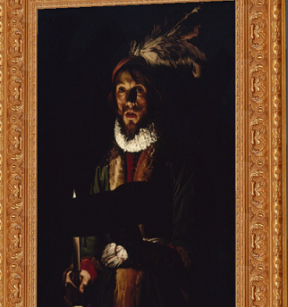
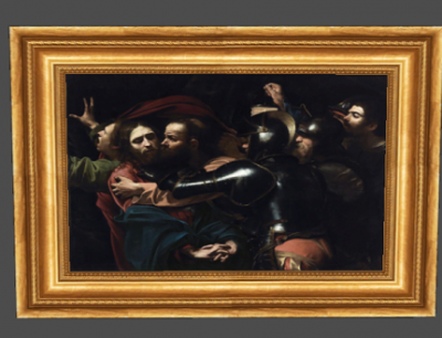
Big thumbs up for the Chiaroscuro art, more of that please!
 I think it fits into the TDM vibe so perfectly.
Sure, I can add some more tenebrist/chiaroscuro paintings. I'll put them up tonight or tomorrow. I have some other stuff to compile too.
-
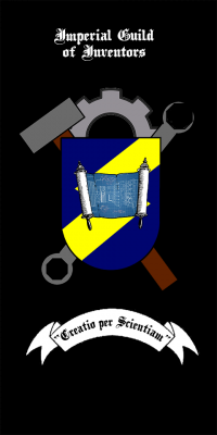
Yeah its meant to be suggestive of a lightning bolt without being one. The blueprint will be clearer in the final version
-
I do like some of these ideas. Like I said above its just a mockup and the final version would have a blueprint that isnt blue or on a Torah scroll. Aas far as the number symbols, its honestly on the simpler end of the spectrum of early modern period guild crests.Artistic design-by-consensus is kind of a doomed enterprise. But since you're looking for feedback... The combination wrench looks awfully modern to me. Using the hammer and gear together draws direct comparisons with Builder iconography, which isn't really desirable. The blueprint reminds me strongly of a Torah scroll, and I don't know if having it be actually blue makes sense in the setting.
The Inventors are the mad scientists of the TDM setting. I think you should stick to images like clock hands, flasks, fancy clock gears, etc. And fewer symbols overall so it's less busy. Something more like these:
https://fbcd.co/product-lg/6995e425220a8ec8108a5fea18f64274_resize.jpg
https://betafishmag.files.wordpress.com/2013/08/steampunk-spectacle-logo-small.jpg?w=600
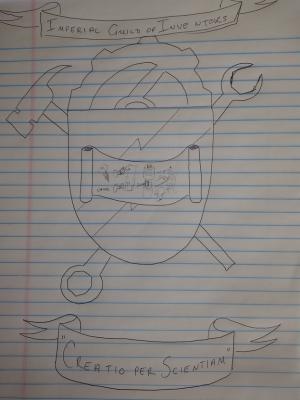
Edit: I think what I will do is have a blueprint of some type of clock. The hammer will look more like the one in the sketch, ie, a claw-hammer and not this builder-reminiscent one. Good point tho about the combination spanner, I think I will simplify that.
I still think a protractor would make it clearer, I think I will try to work it into the next mockup if I can keep it from seeming too mason-y, in fact maybe replace the hammer with a folded protractor, and then maybe put it to a vote to make it semi-official, make decal and banner skins for it, and put it up on the wiki.
-
Wow, new paintings as well!
I really like the guy in picture #3. He looks both terrifying and scared. This will add massively to future horror missions. Oh yeah.

Edit: Would be great, if you could post some shots of your work in the relevant thread, I am really curious to see your efforts so far.
Im a big Caravaggio fan.
-
 1
1
-
-
Its the same res as the ones already in the game, I checked for every .dds I madeA note about loot assets, you don't have to go that low poly with it. It looks more like from Thief 2. At the same time, you have 1024 textures for the material, while the painting texture is 512 px. Pixel density/ratio should be similar across all the surfaces.
Edit: and as to the polys I didnt make the models, just reskinned the ones already included in TDM.
-
-
-
-
-
-
This is just a mockup. If we go with this general design, the final version will look a lot cleaner and clearer and be better balanced. There's a few things I'd like to change but I usually don't take too much time on a mockup when things will likely change anyway.
Edit: For example, I'll move the tools so they aren't overlapping with the gear, and rebalance the blueprint so that the math scribblings are clearer and more prominent in comparison with the schematic. Also I probably won't use something that looks like the Torah for it, and realistically it won't be blue either, probably a parchment-coloured background.
-
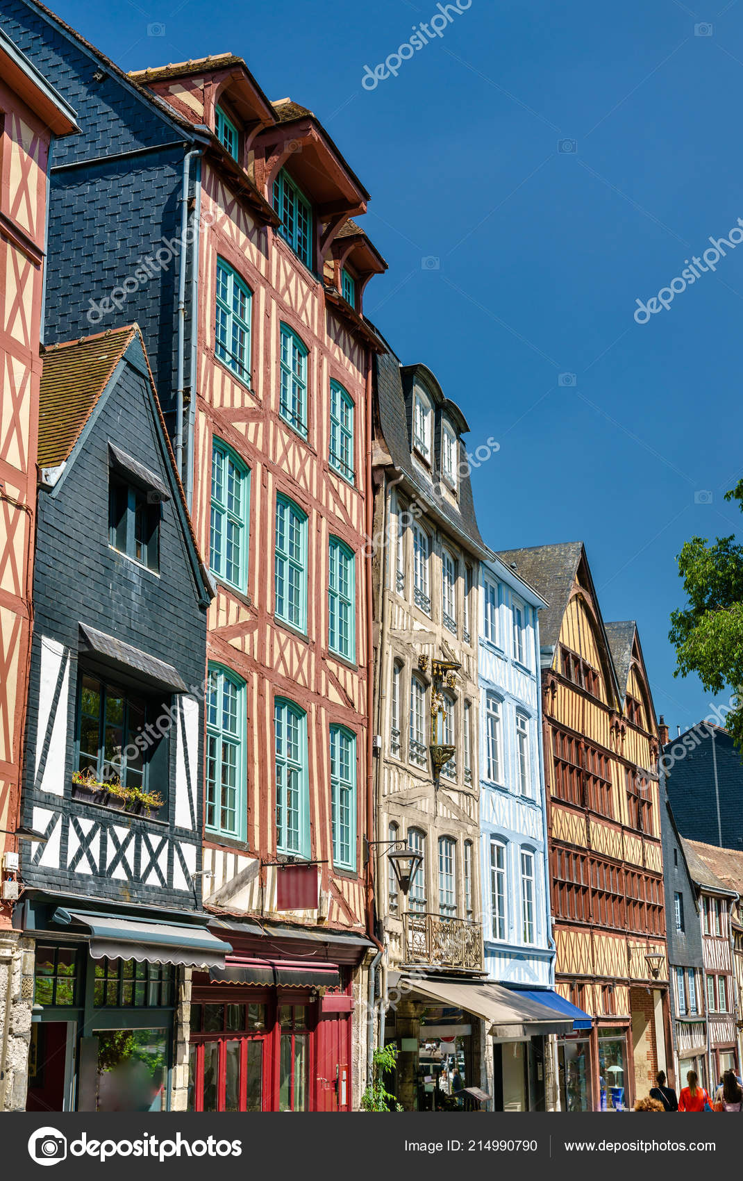
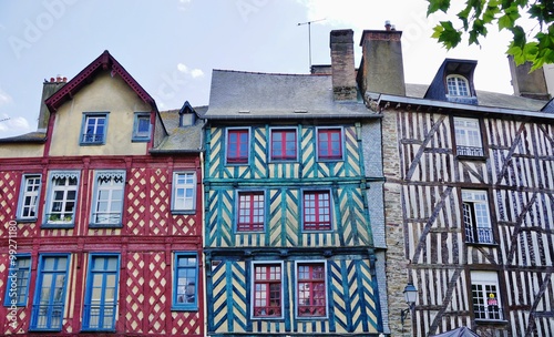
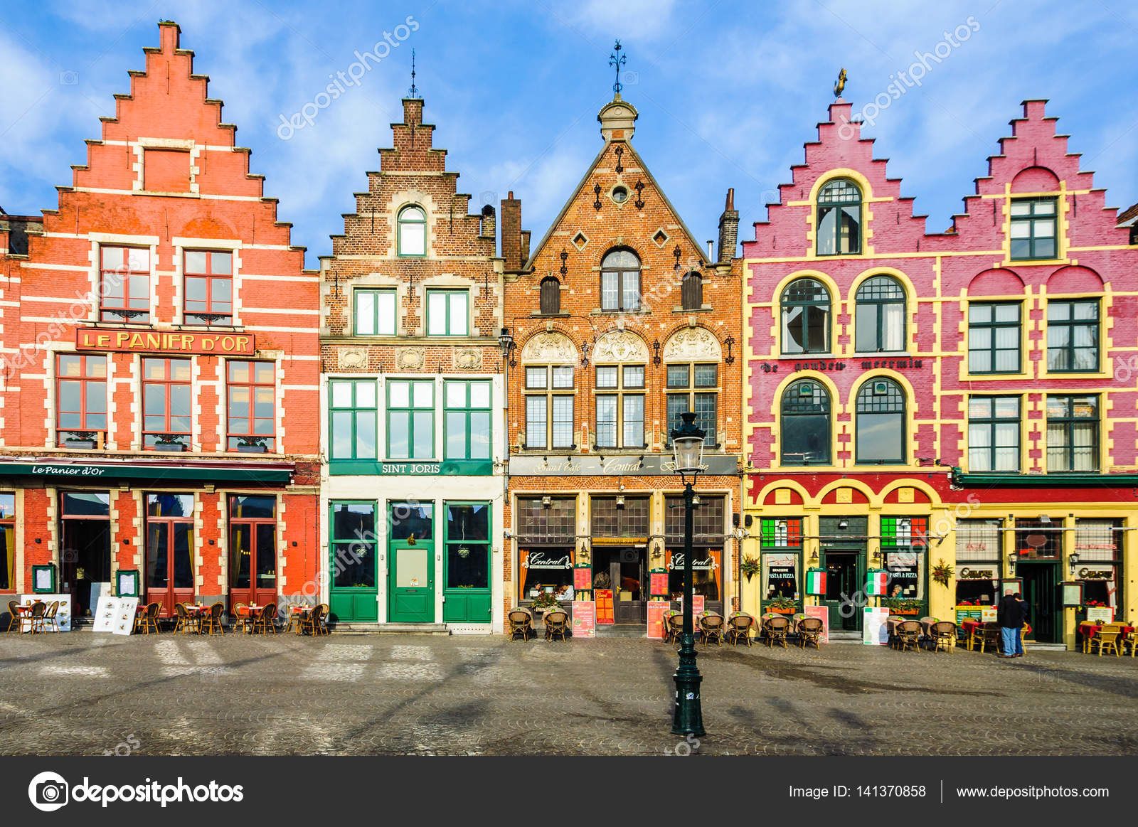
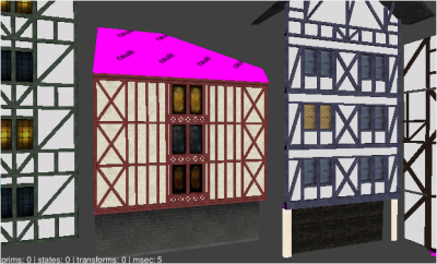
One from Rouen. Another is somewhere in Brittany but I don't recall exactly where.
For anyone interested, I compiled some of the assets I've put together. They can be downloaded at the following address:
https://drive.google.com/file/d/1eSsVeInHaexV7hTTBcFz_WlyFmHIDqhO/view?usp=sharing
Edit: Strasbourg and Rennes are the other two locations.
-
 2
2
-
-
-
I will upload a .zip of some of what I have so far this weekend and update it regularly as I add more.
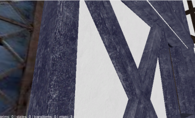
Edit: Note that I am actually doing all the halftimber buildings in DR so the plaster and timber are separate textures.
-
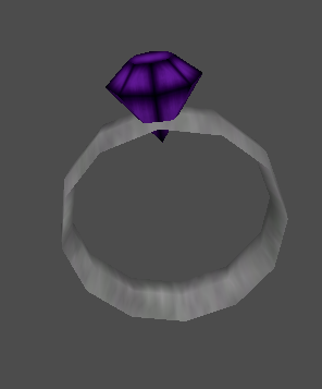
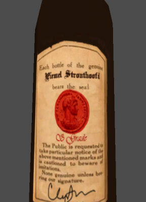
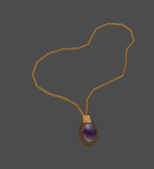
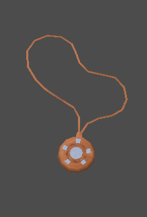
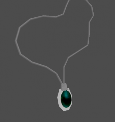
Im working on some maps where Ive added a bunch of custom skins to some assets. I thought I would ask here - once I am done, would there be interest in me sharing these? Or can I even add them to the core repo somehow? So far I have skins for a bunch of loot, particularly jewellery/gems and paintings, and some NPCs. Some of the NPCs I may want to keep for myself, as Ive made new guard skins for the district where my maps are set and I want them to be unique to that district and recognizable as such, but if anyone wanted to set a FM in that part of town Id be willing to share those on an individual basis as well.
Edit - the district is inspired by some areas in northern France and the low countries and their style of early modern architecture - see below - so Ive created a lot of colored timber and plaster materials as well that I can share too. On top of that I have a bunch of wallpaper and carpet materials I can share.
The inspiration for the Bridgeport district of Northgate:

-
 1
1
-
-
Okay. Im just starting to add scripts to a couple maps Im working on (some for practice, 1 or 2 for eventual release) so Im not sure how this will work in practice. Ill revisit this in this thread if I cant work it out.
-
-
What about a blueprint or a parchment or something in the center?
Because you have the gear in the background, and the hammer and spanner too which represent the guild so a blueprint/design sort of logo in the middle might cover the creation aspect of the guilds ethos.
Either that or something like a moon crest or wolf or something just so its not blank in the middle.
I think the rest of the design looks great around that. Its just nailing that center bit.
Exactly my thoughts - the middle is whats lacking. I really like the idea of a blueprint. Im gonna sketch this up now.
-
 1
1
-
-
Ive seen on the wiki how to set it up so loot is not frobbable til a chest is opened. I have a chest type object with a glass top that is breakable. I want the contents unfrobbable until it is opened OR broken. How would I approach this?
-
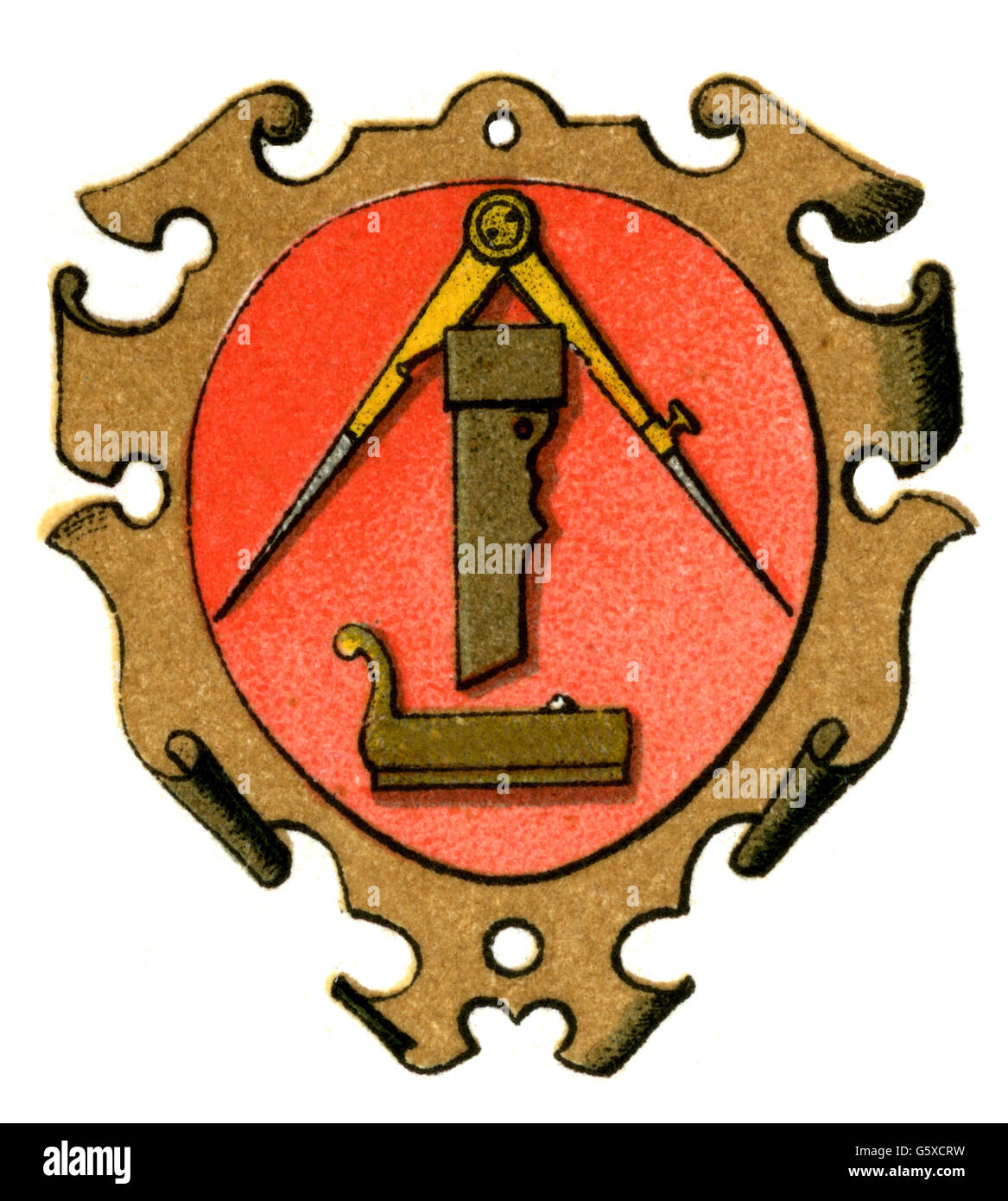
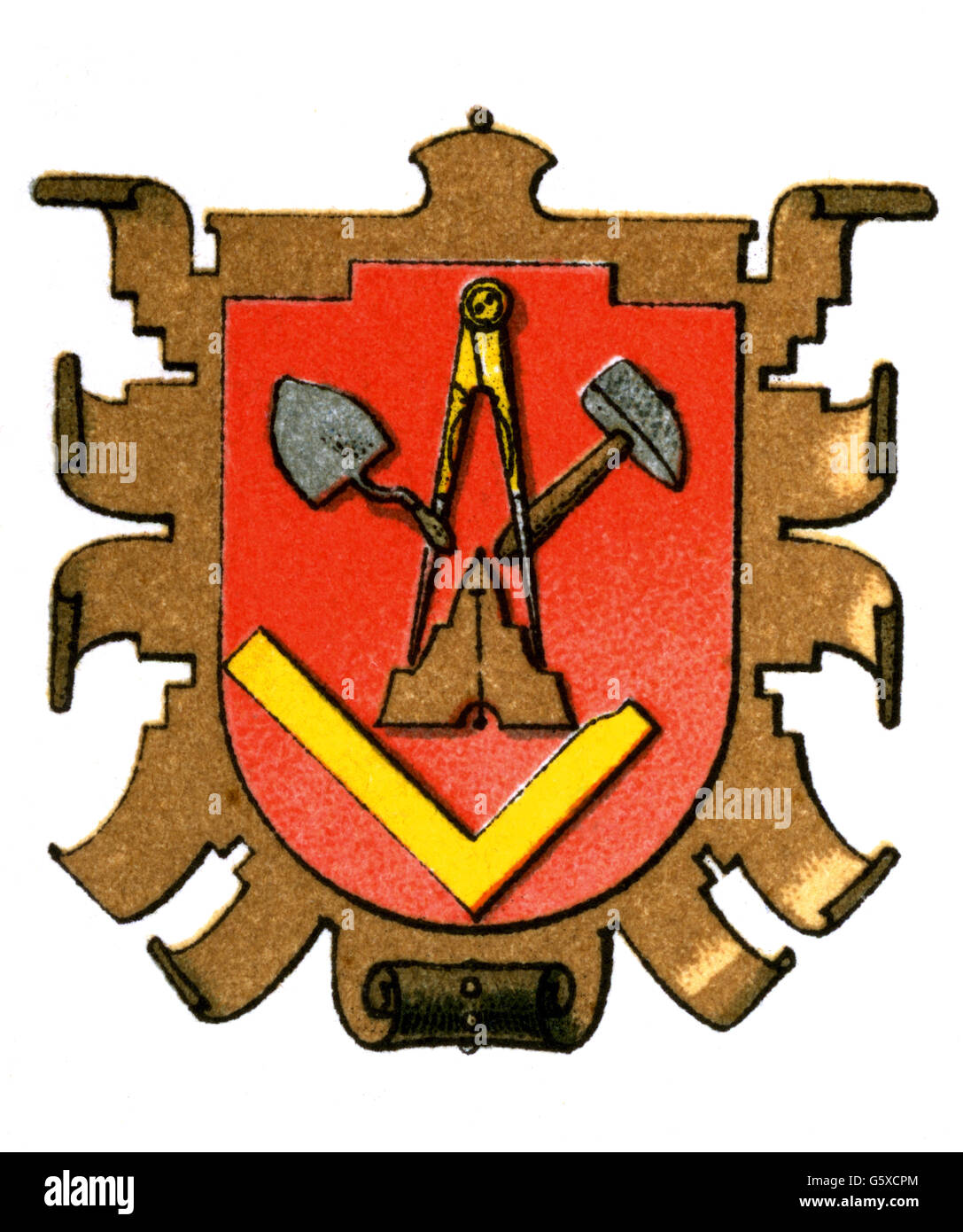


I used there as inspiration.
-
Is there a IG motto? I know Latin and I used the Creatio per Scientias (creation through knowledge) on the logos I created, but I was thinking thatd just be a logo for the lodge/college/whatever I have in my map, which is in a district of Bridgeport called Northgate that I created for the series Im working on.If you need any coat of arms elements for inspiration, here's a little database: https://commons.wikimedia.org/wiki/Category:SVG_coat_of_arms_elements
This subcategory and this one could be particularly useful, I suppose. I think it also wouldn't hurt to look at a variety of historical coats of arms used by guilds in various countries of Europe, and other areas.
I've designed a fair few coats of arms and emblems over the years, and I'd be glad to add my two cents. It all depends on what people expect from the IG. Should they be very upfront about the steampunk elements, or have more traditional, more basic craftsman imagery in their emblem, or some happy equilibrium of both ?
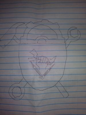
I'm intrigued by the lightning bolt idea, but I wonder whether a hand holding it can be made to look convincing. here's a thought: Maybe instead of a naked hand, or an armoured or semi-armoured hand, you could use a hand in a heavier-looking glove. Something for the seasoned inventor and engineer, while handling dangerous objects. After all, you wouldn't want to catch lightning (and by extension, electricity) with your bare hands, now would you ?

We could make up some pseudo-Latin or actual Latin translation of the IG's motto. Did any of the few official TDM missions use Latin in any way ?
Edit: wrt Latin the wiki states old and official texts should use Latin where appropriate.
-
I looked at the coat of arms for both medieval/early modern guilds and present-day mechanical engineering organizations for inspiration.
Any further suggestions? I did another and I cant find it now but it was 3 interlinked gears of varying sizes on the shield with crossed lightning bolts behind it and an open book under.
-
Revision 1. Im on my balcony and dont have whiteout nearby and messed up the lightning bolt but the general idea is there. Removed the square and flipped the protractor to remove the masonic connotation. Changed the background to 2 tools and made the lightning bolt more central, plus putting it in the hand makes it clear that it represents harnessing power.
-
 1
1
-



dmw's DR noob megathread
in TDM Editors Guild
Posted
Is there a way to override the ase_100 error that pops up when a horse doesnt have enough room? I want to have a horse in a stable that is smaller than 100x100. It is visoble but not reachable by the player, so messing up the AI's behaviour is not a concern for me. I just dont want that message to appear for the player when they launch the FM.