

peter_spy
-
Posts
3317 -
Joined
-
Last visited
-
Days Won
116
Posts posted by peter_spy
-
-
1st version looks wet, but 3rd one is promising
")
-
7 hours ago, ChronA said:
Armor rusts, and the more you ignore the rust the faster the rust spreads. (Corrosion reactions scale with surface area, which is increased by rust flakes and scratches. A mirror polish minimizes surface area.) So if you neglected your armor so that it looked like those Fromsoft references, you would be buying a new suit of armor within a few years, and suddenly that captain-of-the-guard salary would be stretched pretty thin. Plus your employer would probably fire you for making him look like some pitiful hobo who hired a bandit to guard his house instead of a proper man-at-arms!
So yes, in a realistic setting, an elite guard like that would probably have armor that is polished to a mirror finish, because part of his job is in fact to care for his armor. That would include making sure that it is immaculately oiled and polished before putting it on.
That said, TDM is a fantasy game, and it's important to have a cohesive aesthetic to communicate the themes of the setting. One of the most common of those themes is the depravity and corruption of elites, and an easy way to communicate that visually is to put a thick layer of tarnish and grime on all their shiny trinkets. In contrast, to modern eyes mirror polished armor communicates vanity, grandiosity, and egomania, but not necessarily depravity. In that sense I agree that the new model should be a separate variant rather than replacing the default, so that FM authors can be intentional about how they use it.
Hmm, that is a sound explanation to me
But yeah, as you pointed out, we are so used to aesthetic conventions from other dark fantasy games, Souls and souls-likes included, that when something looks brand-new, we immediately get sceptical about it.
Another thing might be conventions and tricks used when making materials. Quite long ago, I've heard an advice regarding diffuse and specular texture relationship: first off, to take care about all kinds of damage and imperfections that can be seen from any angle, and these typically will be included on both textures: rust, heavy dirt, dry/wet parts, etc.
When you're done with that, think about imperfections that could go to specular texture only, things that are visible typically from acute/obtuse angles, with specular highlight doing its work most: dust, micro-scratches, fingerprints, minor water smudges, etc. That really makes a material look interesting
So I'm probably biased because of that, and, since artists in other games use these tricks really well too, when I see a material without a specular, or reflection without any mask, my first reaction is like ewww...
 But that's just me, I guess
-
For the record, that concept art is awesome!
-
On 11/28/2024 at 3:36 AM, ChronA said:
I don't think I've seen that. Now I'm curious.
There you go (and anyone interested, ofc
)
-
49 minutes ago, Arcturus said:
Does this look like glass too?
It looks like super polished metal armor, taken out of the closet once a year to use in a tournament or battle reconstruction event. Very sterile look. I imagine that something a guard wears to work everyday would look much more dull and dirty. Dark Souls & Elden Ring armors are an awesome reference, the material work in particular.
-
"Have you ever had and experience that disproves it?"
Yes. Prey: Mooncrash. I hated it in the beginning, but it grew on me and I ended up loving it. It was basically developers saying: "We get it, but trust us, we want you to be able to experience the simulation in its whole glory. Just give it a go." And they were right, that Prey DLC is superb. I learned that stepping out of my bubble to experience something slightly different can be very rewarding and made me appreciate developer's efforts even more. I'd probably savescum my way through it, but in Mooncrash, dealing with consequences of your failures is more fun / challenge, and without quick reloads you get to see how simulation can respond to it, often with unpredictable and hilarious ways. It's sometimes unfair because of that randomness, but oh boy, it's also super interesting and rewarding, when you actually finish your run by the skin of your teeth.
Also, I like checkpoint saves in games, it's an art of its own in game design. When I don't have to think about saving at all, because automatic checkpoints handle it for me in seamless and unobtrusive manner, so I can focus on playing – that's the best scenario for me
Btw. there's a whole separate topic in psychology of games related to saving systems. LGS / Ion Storm's Randy Smith made a presentation on compulsive saving / loading, "How to help players stop saving all the time" – something like that
I can share it with anyone interested.
-
 1
1
-
-
There are OG Thief missions where you have a blackjack and you get KO restrictions on higher difficulty levels. This was mostly context-based, i.e. if you sneak into a police station and knock out everyone, someone will notice and ring the alarm, something along these lines. So it's not like having a blackjack in your inventory and having KO restrictions is mutually exclusive.
-
Why?
 When I make assets I always use default values, and I think it's pretty much the only way to ensure everything looks the same on all players' computers. Obviously they can set it up as they like, but they have an easy reference point, in case they want to return to intended look.
Besides, in order to get consistent results, you have to at least try to assume a model, something that will return somewhat logical results. Since this is non-PBR, it's hard to do; you don't even have any consistency in how models, materials or other declarations were made, nor how mappers use lights in maps.
-
51 minutes ago, Arcturus said:
r_bloom_weight is set to "0.7" both in my 2.12 installation and in main repository. I never touched those values which means the default must be 0.7.
Try deleting darkmod.cfg and restarting the game. In both TDM versions I currently use, 2.10 & 2.12, the defaults are as above, and the bloom slider is always in this position:

-
3 hours ago, Arcturus said:
With these settings it looks closer to what's currently in darkmod while also fixing the problem of garish highlights:
slope = vec3(1.15);
power = vec3(1.3, 1.3, 1.3);
sat = 1.1;

Are you using default bloom settings? I don't remember Gemcutter being that overblown in highlights. These are the defaults:
seta r_bloom_blursteps "2"
seta r_bloom_downsample_limit "128"
seta r_bloom_weight "0.3"
seta r_bloom_detailblend "0.5"
seta r_bloom_threshold_falloff "8"
seta r_bloom_threshold "0.7" -
IIRC, the lower-resolution mirror was more pixelated than blurry, but I'm not 100% sure about that
Also just adding a mirrorRenderMap as blend add image stage looks super clean and artificial. You can create an image stage and use a texture with alpha, or make alpha from RGB channels of a texture (e.g. a specular map), so you can mask portions of a reflection. You can use it with diffuse and specular to create dirt, damage effects, etc.
[Edit] Example:
Also note that mirrorRenderMap ignores normalmaps, so it might be better to use cubemaps for that. That and performance reasons
-
Btw. @cabalistic was working on the new bloom, maybe he could share some insight too?
-
6 hours ago, Arcturus said:
Neither the carpet nor the white plaster panel use specular maps. Most textures don't use specularmaps. You don't need specularmaps to blowup the image easily.
Of course not, since in non-pbr engines specularity is both diffuse and specular-driven. It's basically a ratio between those. That tonemapper changes the look of the game quite a bit btw. The contrast is much lower.
-
IIUC, the problem isn't that much with bloom itself, it's more about the specular response. I remember there are lines that makes specularity stronger than usual, reducing effective texture intensity range to something like 0-192 instead of 0-255. (If you turn postprocessing off and use specular map with values above RGB 192, the specular hotspot will get overblown, while it shouldn't.) Also I believe there's either some fresnel term there as well, or a code that increases specular intensity at grazing angles. IMO all of that should be removed first, before we fiddle with bloom.
Also, when it comes to bloom, maybe we could have better controls over it? Right now, we can control bloom only by going over RGB 1 in emissive textures (10 seems like a good starter value). But that makes the whole surface glow like a neon lamp:

While in engines like UE3/UDK you can set up bloom to be stronger without loosing surface details that much, something more like this (top right example):
There are some cvars related to bloom, so maybe we just have to play with them more:
seta r_bloom_blursteps "2"
seta r_bloom_downsample_limit "128"
seta r_bloom_weight "0.3"
seta r_bloom_detailblend "0.5"
seta r_bloom_threshold_falloff "8"
seta r_bloom_threshold "0.7"
seta r_bloom "1"Edit: the UDK docs mention something like bloom kernel size, that's what we're probably missing in our cvars.
-
1
-
-
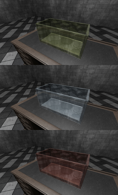
For glass, these might be shader limitations in this model, I wouldn't have my expectations too high. Last time I was working with glass, I managed to get semi-consistent results with transparent colored glass, but the cubemap reflection would still glow in the dark, so it was toned with shaderparm3.
-
The new bloom is meant to be working with rgb ranges above like that though. If you don't want it, don't go overboard with blend add values. It works pretty great with light sources:

-
IIRC, setting custom resolution to mirrorRenderMap stopped working a few versions ago, the output is always at game resolution. That blur effect looks good, we could have frosted/steamed glass now. But, I worry about the performance cost. That said, even if you try making such material in UE4/5, you'd get a huge performance drop too, at least in the editor windows. Probably best to use it sparingly anyway
-
Btw. that sceptre is a great candidate for re-modelling, it looks way too simple for what you can do in TDM these days
-
Yup, that looks promising
-
Also, what I was able to achieve without parallax mapping, a few years back:
-
Hmm, I think cubemaps are supposed to be drawn on top of the surface, as the additional fake reflections. But they should be affected by normalmaps, and height maps as well, IIRC.
I've been trying to find videos on YT with practical applications, but I might need to record it myself, since most of them are focused on gameplay.
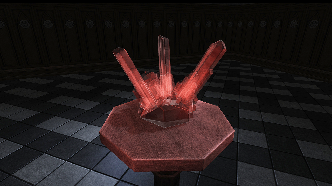
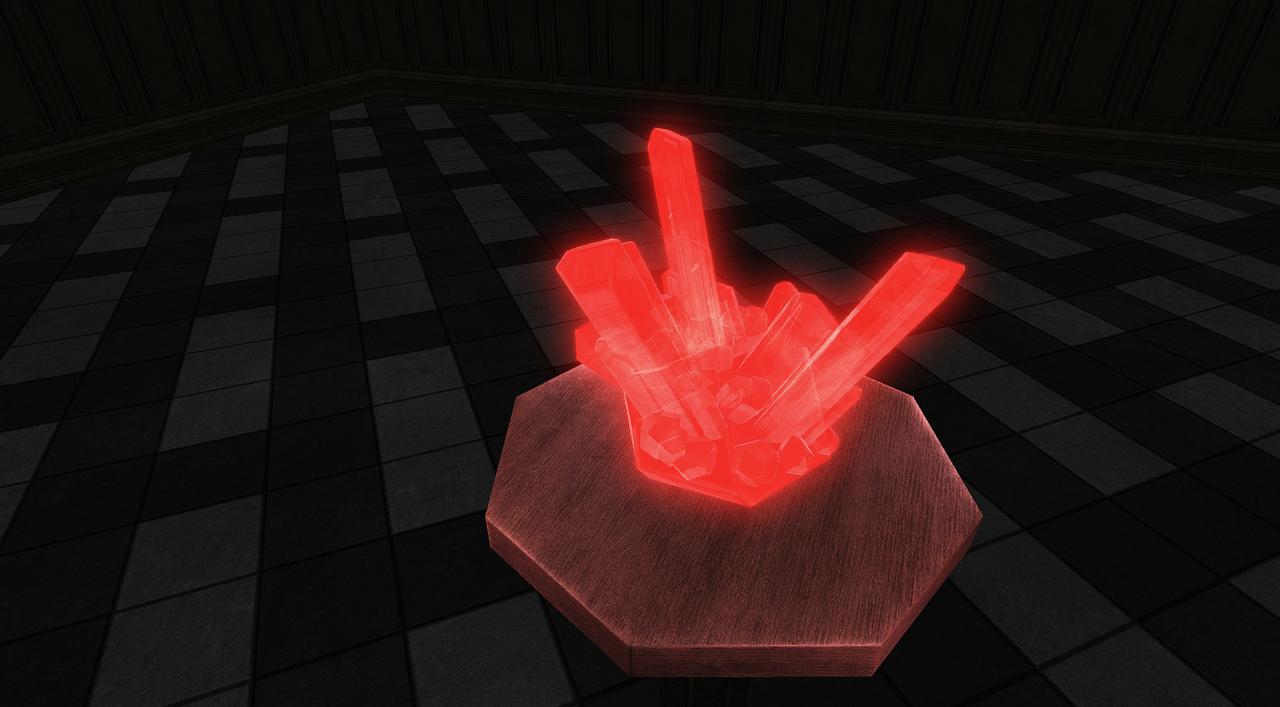
Elden Ring crystals. The effect is more pronounced when you look closer:
https://youtu.be/z1LcG6YCoNY?si=e1XoxYr9fm2KZUCa&t=110
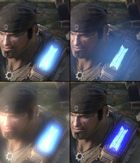
Gears 5 ice:
-
Glass seems to be working as expected, this is a lead glass though, not raw crystal. Parallax mapping is a good candidate for the latter, as you can create an illusion of something being inside, without doubling the actual number of polygons. One of the few applications of parallax mapping today. You can also try ice.
-
As a side note, you might want to check texture sizes on that currency pack. 1024 px for a single coin or ingot is a big waste in terms of texture memory / pixel density. You can easily scale it down by half, or even quarter, with such small objects.
-
18 hours ago, Arcturus said:
fainter reflections look less like metal and more like a clear-coat type of shader.
For metals, you'd have to author your cubemap a bit more. If you just added that studio cubemap or envshot made in the game, you need to tint these images with the color of your metal, it's not done automagically. This is where the dst_color blend mode has its advantage I guess.

Better looking metals in Darkmod
in Art Assets
Posted
Yup, this looks consistent with my findings from several years ago.