Search the Community
Searched results for '/tags/forums/light gem/' or tags 'forums/light gem/q=/tags/forums/light gem/&'.
-
I think the hood should poke out over his face a bit more, to allow a shadow to more easily cast over his forehead/face. Part of the plan was to make him mysterious by always casting some shadow over his face, in conjunction with the cloth scarf thing over his nose/mouth. Garrett lacked a lot of mystique in TDS because they kept showing his whole face in the light in cutscenes, etc. By having a hood that pokes out more, this would help create more dramatic shadow effects over his face. There might be some cloak-wearing StarWars Jedi or Sith we could look at for reference. This is the only example I have to somewhat show what I'm talking about, though I don't think this fully captures the ideal. I think it should jut out a bit more and fall vertically lower than what is shown here:
-
City Objects - lampposts, streetlights, cornices, bins, crud (I'd like our City to be somewhat dirtier than Thiefs), window objects, signs, trees. Light Objects - lamps, streetlights, bulbs, lightshades, chandeliers, candles, torches, spotlights, wall lights, uplighters, downlighters...all with a vaguely art-deco/neo-classical style to them. Furniture Objects - tables (many varieties, rough, cheap, expensive, basic, huge, small, circular, hexagonal), desks (writing, dressingtables, chests of drawers), sideboards, mantlepieces, chairs (again, many types), sofas, chaise-longues, armchairs, stools, footrests, surfaces, ovens (range-type), stoves. Beds. Loot Objects - coins, rings, diamonds, plates, paintings, bowls, cups, wine bottles, purses, necklace. Detail Objects - books, candlesticks, mirrors, hairbrushes, plantpots, food, plates, bowls, cups, logs, utensils, statues. Useable objects - lockers, storage boxes, crates, safes, levers, switches potions, flashbombs, mines. Character Objects - basic cityfolk - men and women (fat & thin). Peasantry/servants. Nobles/richfolk. Pagans. Hammer-equivalents. Keeper-equivalents. Craymenalikes. Robots. Tricksie Manfools.... Thieves of course. Standard guards. City watch, Burricks, Spiders, Zombies, Craymen Weapons - short sword, longsword, war hammer, ornamental hammer, bow, crossbow, various arrows, wands, blackjack, axe, mace, club
-
Wow, a man of many talents. Coming up with concepts for furniture by doing some research into the relevent time periods is something that needs to be done. I like the museum stand for that reason. The concept art for T3 involved a lot of dynamic sceans and good use of colour, that gave designers a lot to work from. In comparison, that shot of the room with the light on the wall is really bland, in terms of colours, archetecture, and overall feel. When the concept art was drawn with the camera at a really dramatic angle, you might think "well, the camera angle itself isnt' saying much - your viewpoint moves around all the time in the game", but what you really should be getting out of the image, is looking at it at a whole, and it gives you a feeling, and then you say "well, how can I somehow translate that feeling into the game, and give the player that feeling when they play the game?" I think that is the true power of concept art. We need something that says something new. Well not real new - we know what the Thief world is like - dark and moody, with brooding shadows and atmospheric lights, and ominous sillhouettes. But see how the concept art took that "theme" and gave it its own character? It's not easy but that's what I think we should aim for. A unique style of our own. I can see these sketches are just drafts, but they're a good start.
-
I'm not a music guy, so get your salt grains ready. I think these sound pretty good. Nice, quiet background ambience style tunes. The first one is nice, although the exact tone of the piano gave me a different 'feeling' than I would expect in the game. A little more light and airy that I would expect, but not bad altogether The second one is also nice. Defintely more ambiance than music. I was with it all the way till the end, where some of the sounds became a little too rythmic, and began to sound more music than ambiance. I think there is a place for musical ambience and environmental ambience, but I question whether they should be mixed together in the same track. Triggered changes could work with this, of course... music changes are great when done correctly! The third one was probably my favorite, particularly the beginning. Great, dark, brooding musical ambiance. My one complaint is the drastic change between the first half and the second half. This is two different themes smashed into one song, I think, and maybe they should be separated. The first half should continue into a new movement, but it should definately carry over the themes. Also, I noticed quite clearly the chimes used in the first two, sounding like distant clock bells. Nice sound on these. However, in ambiance, I think you may want to avoid features such as these. On a five to ten minute loop, the reoccuring bells could seem strange to a player who recognizes a midnight clock chime occurring every 5 minutes. The chimes would work fantastically as an intro segment that isn't looped, or a triggered musical bit though. Note that this restriction doesn't apply to all features; bangs sudden dischordant sounds, etc. can fit in with the environment and not call attention to themselves. Anyway, just my opinion, as a non-sound designer
-
I also like the masked face look. Makes sense from a need-to-stay-hidden standpoint. I think it can be pulled off as long as we can avoid him looking like a ninja in the face. I may be wrong, but I think it might be a combination of a few things: (1) 'percent of coverage,' (2) 'angle at which the cloth is worn' and (3) 'tightness on the face' that gives ninjas the ninja look that many of us are accustomed to seeing. However, it might be worth researching classic/medieval thief attire, if such a thing exists. Perhaps dark makeup was used instead, or something? Either way, if we need to lock something down now, I'd be cool with using the masked face. I didn't like T:DS in that they showed Garrett's face in the light a lot. I think we should try to keep a certain 'mystique' of our character's appearance. Whether that be done by his face always being in the shadows in cutscenes/art, or a good portion of his face being covered by cloth, or a combination thereof -- I'd be a happy DarkMod camper
-
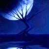
Ahh, excellent - I didn't notice these 'developer' threads here before. I'll try to crank some sketches out for y'all soon and read more of these threads. In the meantime, keep your eye to the shadows and your mind to the darkness. For without light, there is no distraction. - Darkness_Falls -
-
The glare effect bleeds out a bit, but for the most part the lights that make up the windows only work on the windows themselves. I wanted it that way so they'd stand out and I could check and see how they looked. Once I tone it down it'll be a good moonlight effect. Similar to the shafts of light in Thief 3, but more vague and hazy.
-
Lol. A perfect little hiding spot for our thief, having a shadow directly under a light like that.
-
Yeah, you're totally right. When I first saw it I thought....THIS is how Thief 3 should have looked. You can see the relationship with Thief 1 and 2, but it's still light years ahead of either of them. It's consistent with the Universe. More and more I am convinced we can do this. I have a lot of friends who are professional actors in theatre, they'll be providing the characters for the voice sets! Can't wait to get started on those.
-
Umm. So. I just lost the file for this. I had no backups. Or rather, I had many backups, but only in one folder, so they all got nailed. Um. Yeah. I'm actually seriously in a terrible mood about this now - two or three weeks of work down the tubes. Will be taking a bit of a break before I guess I'll start it again. So.. yeah. If there's any really light 3D work you want done, I may be able to but that's probably it for a bit.
-
Really? I thought the door looked almost exactly like the older city doors in TDS. I think it looks a little whiter than normal because of the light glare.
-
I consider this a small occasion since his woodpanel texture is the first normalmap I've done by hand. It's a great texture overall, but I had to do a few tweaks here and there to get it to work properly ingame...like change the paneling a bit towards the bottom cuz they bent a little towards the right and whatnot. Finishing it up helped me learn alot about Photoshop and MS Paint in the process, so it's all good. I still have a bit to go before it's completed, but this is the 80% complete texture, and the first one of Blackthief's textures I've done properly. Check it out HERE, mangs! P.S: It's dark in the renderer cuz I wanted to show how the light would catch it. I'm particularly proud of this one.