Jump to content
The Dark Mod Forums

Poster creation?


lost_soul

Recommended Posts

I've done some image editing in the past (background removal, cropping, scaling) but I am an idiot when it comes to actually printing and measuring things. Some things I don't understand


A. They say for a large 24x36 inch poster, you need something like 6000x9000 pixels. How can this be true when a 1920x1080 resolution image looks fantastic on a monitor of that size?

B. What about CMYK and RGB? Should something be CMYK to be printed?

C. What's with this whole "bits per color" thing? I know about color depth on monitors (i.e. 16 or 256 colors. Apparently you can have a 24-bit image which is only 8-bits per color? Confusing! Although I understand that you can never fully capture an image using a computer because of a lack of infinite bits to show all possible colors, I thought we passed "good enough" at least a decade ago.

--- War does not decide who is right, war decides who is left.

Link to comment
Share on other sites

A.

Printers usually have a resolution of 600 dpi (dots per inch), so your image should be 24'' * 600dpi x 36'' * 600 dpi = 14400 x 21600 pixels. :)


But I doubt 1920x1080 will look fine on a monitor of that size. With a display width of 36'' you would get a height of 20.25'' on a 16:9 widescreen-display, which results in a display diagonal of 41.3''. As soon as you're closer than 65'' to the screen, you will start perceiving more and more subpixelstructures the closer you get to the screen. (Calculation of that distance is based on the angular resolution of the human eye which is approximately 1 minute of arc)


B.

RGB is only a good color representation for additive color mixture. Printers however are subtractive and CMYK works very well there.


C.

A monitor shows colors through the basecolors red, green and blue and "bits per color" just means, how many levels of contribution you have for each color. If you have 8 bits per color, that means that you can have 2^8=255 colorlevels for each color.


It's not necessarily the computer but rather the monitor that is incapable of displayling all possible colors, because it displays colors additively via RGB. If you look at the chromaticity diagram in the image below, you will see that the RGB-tupel spans a triangle and a monitor can only display colors inside the triangle, so that some colors are missing.

CIExy1931_sRGB.png

You could display a wider range of colors if lasers were used for the RGB-Tupels. The edgepoints of the triangle as it is in the upper image are composed of multiple waves with various wavelengths, whereas lasers issue light consisting of only one wavelength. These lights are at the outer borders of that chromaticity diagram, so you'd span a much bigger triangle.

Link to comment
Share on other sites

I see colors outside th triangle :D lol.


I don't have any fancy diagrams but i do print all day everyday.


And my bosses infuriate the hell out of me. they'll take my CMYK image, do a new sign layout with it, then save it back as an .ai with RGB color profile. WTF? Been talking to them about this for 4 1/2 years now and they still don't grasp the concept.


They print to an rgb lazer printer (office paper) so it looks fine. I have a large format CMYK printer, rgb prints like crap on it. Sure it has to do with profiles, program sedning the image, etc... But yellow turns to green... Everytime they do this i just have to redo the job before (or after) I print it.


so I'd suggest finding a printer, asking what they prefer. There are large format printers that use 6 colors, and maybe more too, copy/copy or some place like that probably doesn't have that large of a printer though.

--------

it also depends, I print a lot of banner and decals at a decidely lower resolution than I'd like and they come out OK. People just can't see to grasp the concept that images made for the web aren't good for big prints, lol.

Dark is the sway that mows like a harvest

Link to comment
Share on other sites

Just for the record, I very recently printed an image with 6000x2000 pixels on 1.80m x .6m which is looking absolutely fine, you can't see any pixels even if you are real close - and by then you can't see much details anyway, as the image is larger as your view. And that is just 3 pixels per mm - e.g. about 85 dpi.


Yes, sure, printers can do 600 DPI, but in most cases you don't need that resolution unless you print say something like A4 (paper book sized).


Usually, when you start printing this big, the image is viewed from quite a way back and then it will look absolutely fine. So yes, we passed "good enough" a long time ago. (Just walk close to any advertising to see how "pixelated" it actually is - but you never see anyone really complain about the posters on the bus station :)


Here is a link to a converter:


http://www.hdri.at/dpirechner/dpirechner_en.htm

"The reasonable man adapts himself to the world; the unreasonable one persists in trying to adapt the world to himself. Therefore, all progress depends on the unreasonable man." -- George Bernard Shaw (1856 - 1950)


"Remember: If the game lets you do it, it's not cheating." -- Xarax

Link to comment
Share on other sites

Yeah, of course it is a matter of viewing distance. You can calculate the necessary resolution as a function of the viewing distance. But if you want it mostly independent of the viewing distance, you'd have to go for the maximum possible resolution. Also, in most cases it is wiser to let the 2d-editing application handle upscaling rather than the printer, because the latter does not use proper interpolation methods, so the result will look pixelated up close whereas otherwise it will just look blurred.


Sure, but my point was that you don't NEED the maxium resolution - no matter what Apple tells you with their "retina" displays. If you are never viewing something up close, why should it have the required resolution to do so? There is also the point that this would mean you'd need infinite resolution, because some one could take a magnifying glas out of their pocket and inspect the image :)


In any event, if you want to have a large poster printed in an expensive way, it is really advisable to print a "cheap" imposter first and hang it at the wall for a week or two. Only pay the money if you still like it afterwards - when printed big, some things suddenly look very different :)

"The reasonable man adapts himself to the world; the unreasonable one persists in trying to adapt the world to himself. Therefore, all progress depends on the unreasonable man." -- George Bernard Shaw (1856 - 1950)


"Remember: If the game lets you do it, it's not cheating." -- Xarax

Link to comment
Share on other sites

Printer resolution (dpi) and image resolution (ppi) are fundamentally different things. Printers need to make a dithered pattern of lots of dots of different ink colours to represent one image pixel.


In theory, the higher the ratio of dpi to ppi the better the tonality of your print (which is to say that a higher resolution image could actually have worse colour reproduction). In practice your software will look after you.

Link to comment
Share on other sites

Oh yeah, of course: Dithering. I always wondered how amplitudes are encoded in printing. Here is a nice article explaining all that stuff...


So my answer to question B is probably wrong then. My bad. Must have mixed something up. I mean the color generation is still subtractive, but the mixture is additive through spatially multiplexing the colorinformation.

Link to comment
Share on other sites

Your answer to B was spot on.


The RGB model is the one to use if you need to reflect more light. (if you start from a black screen and progress to white)

The CMY model is the one to use if you need to work the other way and absorb more light. (if you start with start with a white piece of paper and progress to black)


So if you want to add colour to black Red Green and Blue are the primary colours and CMY are secondary colours.

If you subtract colour from white Cyan Magenta and Yellow are your primary colours and RGB are your secondary.


Black ... RGB ... CMY ... White


If by amplitude you mean brightness - in printing you start bright and work toward dark with pigments that absorb an increasing amount of the colour spectrum. For TV, Film and computers you start dark and work toward bright with pigments that reflect (or emit) an increasing amount of the colour spectrum.


Obviously you 'add' ink to the page - but it's negative sort of adding. Like adding -10 to +20. What you're doing is subtracting.


Does any of that make sense?

Edited by jay pettitt
Link to comment
Share on other sites

Join the conversation

You can post now and register later. If you have an account, sign in now to post with your account.

Guest
Reply to this topic...

×   Pasted as rich text.   Paste as plain text instead

  Only 75 emoji are allowed.

×   Your link has been automatically embedded.   Display as a link instead

×   Your previous content has been restored.   Clear editor

×   You cannot paste images directly. Upload or insert images from URL.

  • Recent Status Updates

    • datiswous

      I tried to upscale the TDM logo video. First try:

      briefing_video.mp4 You can test it ingame by making a copy of the core tdm_gui.mtr and place it in your-tdm-root/materials/ , then edit line 249 of that file into the location where you placed the new briefing.mp4 file.
      What I did was I extracted all the image files, then used Upscayl to upscale the images using General photo (Real-Esrgan) upscale setting and then turn it back into a video.
      I might have to crop it a bit, the logo looks smaller on screen (or maybe it's actually better this way?). My video editor turned it into a 16:9 video, which I think overal looks better than 1:1 video of original.
      · 1 reply
    • nbohr1more

      Trying to be productive on my down-time before Capcom releases Akuma and my son is constantly on my PC playing Street Fighter...
      · 1 reply
    • OrbWeaver

      Finally got round to publishing a tutorial on baking normal maps in Blender, since most of the ones we have are inaccessible or years out of date.
      · 2 replies
    • nbohr1more

      The FAQ wiki is almost a proper FAQ now. Probably need to spin-off a bunch of the "remedies" for playing older TDM versions into their own article.
      · 1 reply
    • nbohr1more

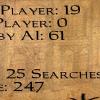
      Was checking out old translation packs and decided to fire up TDM 1.07. Rightful Property with sub-20 FPS areas yay! ( same areas run at 180FPS with cranked eye candy on 2.12 )
      · 4 replies
×
×
  • Create New...