

snatcher
-
Posts
1196 -
Joined
-
Last visited
-
Days Won
24
Posts posted by snatcher
-
-
Thanks for the explanations @stgatilov
There is code, images and audio files. Do sounds follow a different treatment? Because I would say all sounds (in my case) are properly detected and pre-cached while images aren't.
-
It was my fault at the very beginning but later I started following these guidelines: Precaching (def files).
When I debug my mods (decl_show 1) I notice nothing unusual except for the images:
parsing material path/to/image
Trying to load image path/to/image from frontend, deferring...
0x0 path/to/image
Whatever it is, when image X is required by the game for the first time it can cause a stutter.
I say "can" because sometimes the stutter happens and sometime it doesn't OR sometimes I notice it and sometimes I don't.
-
Keep it simple, yet descriptive:
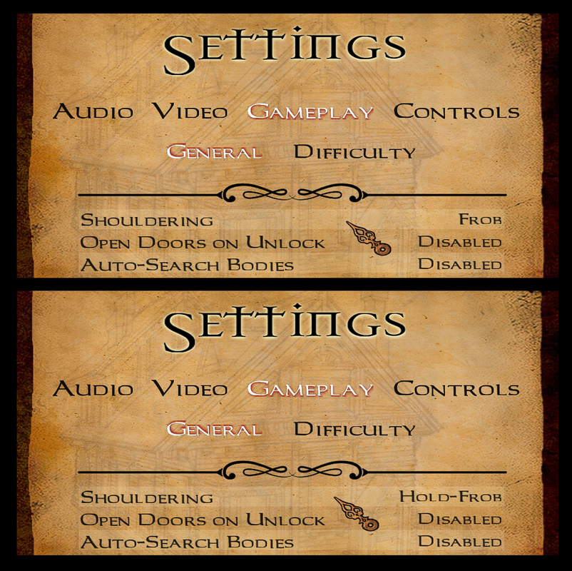
Stick to a hidden "Normal" Hold-Frob duration, at least for the first release. Collect feedback. Adjust or add options when required, not before.
-
 1
1
-
-
Ok, let's make this clear:
- My proposal is to keep things the way they are but to have shouldering on quick-frob (default) or hold-frob as an option.
- My game/Player.cpp does not include a full solution, only shouldering on hold-frob for testing purposes.
-
One of the first things I did when 2.12 was out was to code shouldering on hold-frob here, locally. I have been using my ad-hoc executable ever since with zero issues.
What troubles me to this day is that you people never got to test other shouldering alternatives. Sure, @stgatilov provided the double click but it was quickly discarded because this approach is rarely found in games. In the end, we were forced to choose between Thief-like or nothing: no wonder this topic quickly turned into such a heated discussion.
The second thing that troubles me is how easily body manipulation was discarded. Sure, not many games have such fine control over bodies but, doesn't that alone make body manipulation unique and special in our game? Body manipulation is unusable in its current version, in my humble opinion. Such a loss.
We were told further changes might make it into 2.13 and I have been patiently waiting but months went by and I haven't heard anything therefore please find attached to this post my game/Player.cpp. It was made for 2.12 but can be easily ported to newer versions of TDM. I have just added some comments to the file. Look for my name for the changes.
Please note I will not be providing an executable. This isn't the purpose of my post and you need to build the solution yourself if you want to try it. The purpose of my post is to say that nothing is impossible and we can have everything, and I remain available to assist if there ever is the will to complete this, half-baked initiative.
-
Most Mods get loaded as soon as the mission start and the lack of caching is sometimes annoying. How come images from Mods don't pass the below filter? I would like to understand how this works.
I have tried all sort of tricks and nothing worked and I don't want to end up spawning hidden dummy objects all over the place

/renderer/resources/Image_load.cpp
void idImageAsset::ActuallyLoadImage( void ) { if ( session->IsFrontend() && !(residency & IR_CPU) ) { common->Printf( "Trying to load image %s from frontend, deferring...\n", imgName.c_str() ); return; } // load the image from disk R_LoadImageData( *this ); R_UploadImageData( *this ); } -
What you can do is to restrict the animation to loot and items that go into the inventory (including weapons), filtering out anything else, like this:
if (inv_item != $null_entity && (inv_item.getFloatKey("inv_loot_value") > 0 || (inv_item.getKey("inv_name") != "" && (inv_item.getKey("inv_category") != "" || inv_item.getKey("inv_weapon_name") != "")))) { // animation } -
Hey Wesp5,
The original animation script applies to any object that makes use of frob_item(). The Modpack is not impacted because from day one I limited the animation to loot only but you kept the original version to make it work with keys, readables, etc. Something else in "Winter Harvest" is calling frob_item() thus breaking the logic. I will see if I can figure out what is going on.
-
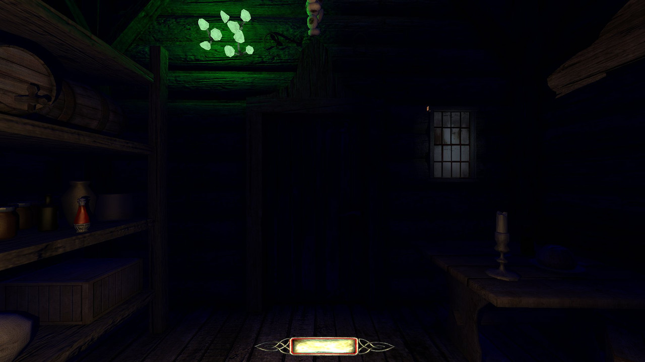
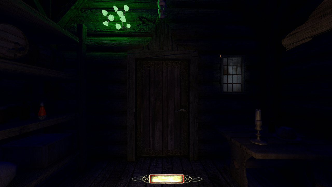
Here are some opinions about The lantern (topic from 2012).
If you tested the Forward Lantern Mod chances are you probably didn't feel the difference. The idea behind the mod is to stay true to the original and instead of blatantly increasing the radius or brightness I opted to distribute the light differently.
If you ever felt something was off with the Lantern go and play a mission with the Forward Lantern Mod. You may not notice anything but your brain should.
-
1
-
-
- Popular Post
- Popular Post
TDM Modpack v4.6
This update makes the TDM Modpack compatible with the development version of TDM 2.13, in case you want to test or use 2.13 now or during the upcoming beta phase and miss some mods... This new version of the Modpack remains, of course, compatible with 2.12.
Let's take this opportunity to introduce a new mod:
FORWARD LANTERN MOD
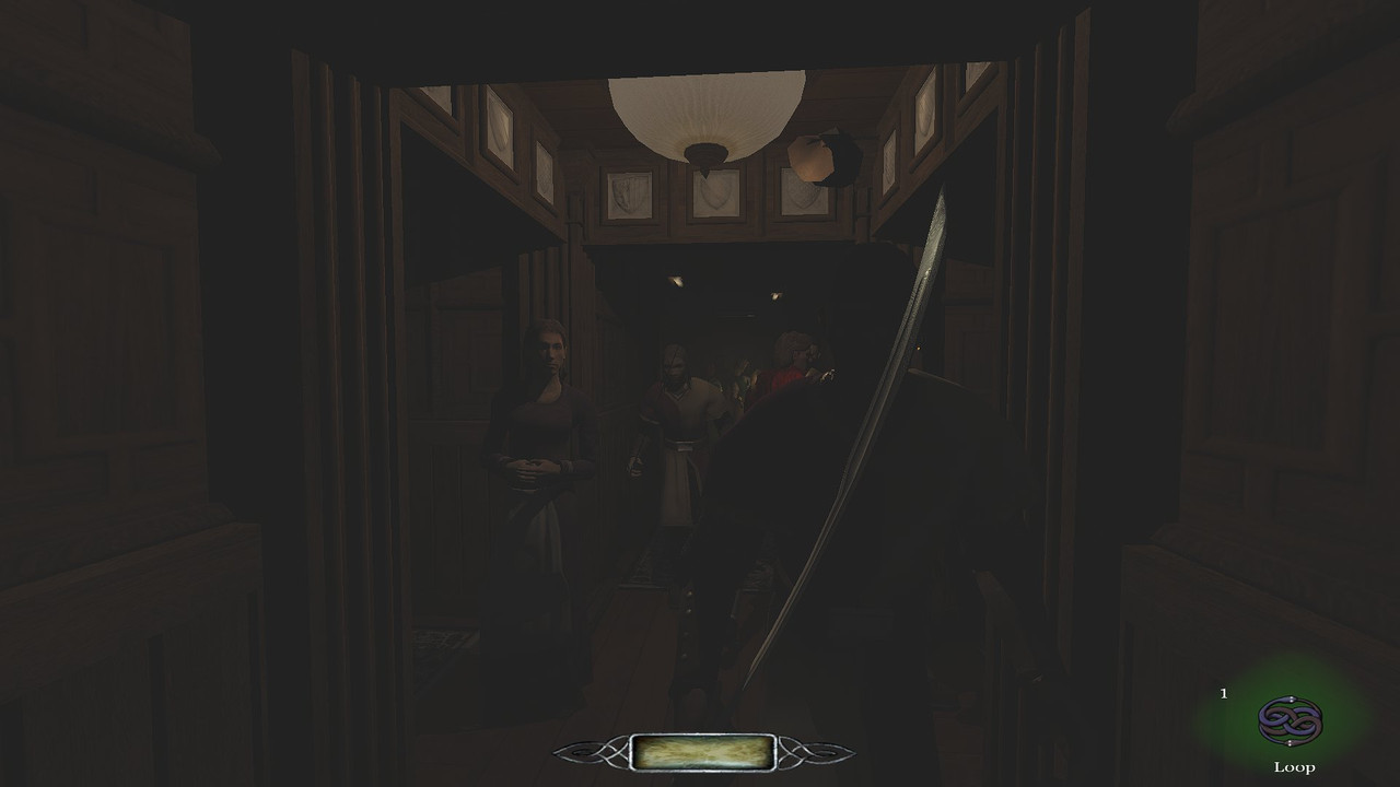
I think this image explains very well what this mod is about:
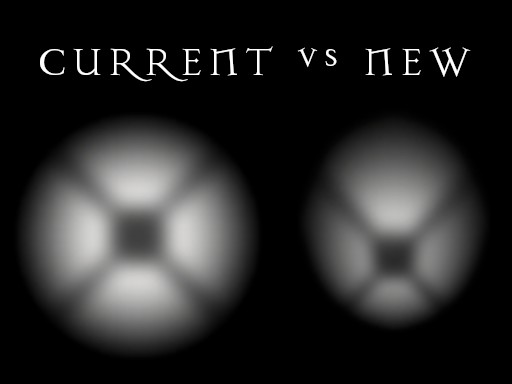
The implementation of the player lantern light has always bothered me. And while I understand the idea behind it, and despite its long radius, it feels annoying and frustrating for some reason. I started thinking about it and I realized the problem had to do with how light is distributed on screen: most of the times all I want is to focus on what's right ahead of me but the light forces me to focus on the sides.
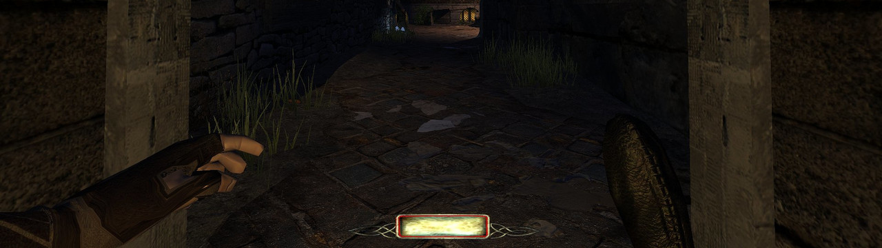
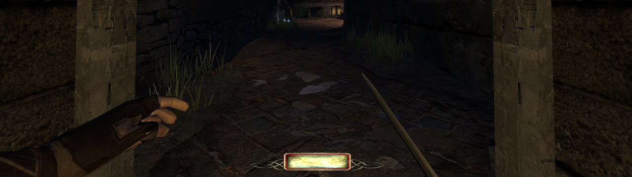
These two images should make my point very clear:
~ CURRENT ~
~ NEW ~
On the technical side it is worth noting I moved the origin of the light from the hip to the bottom of the spine. I did this because in some situations the light would clip through objects and disappear but now that the light is well buried into the body clipping is impossible.
Let us know your opinion about this mod and the player lantern in general!
This mod is available for all missions except Flakebridge Monastery, Hazard pay, Moongate Ruckus, Snowed Inn, Vota 1, 2 & 3., which come with their own tweaks to the lantern.
---------------------------------------------------
THE LOOP SKILL GET ITS FIRST UPDATE
In the initial release I explained I was very conservative with the approach and in order to avoid potential issues you shouldn't be too close to walls or objects when using the Loop. Well, you will be glad to know a workaround has been found and the Loop is as responsive as it gets now and you can use it almost anywhere.
Almost?
I still haven't figured out how to force the player to crouch and the exception remains when there isn't enough vertical space. I hope someday the developers allow mappers and modders to force the player to crouch so that this mod can be fully realized and mappers can start their missions in vents or tight spaces.
- Whoops, I'm outta here!
You will probably notice that the Loop feels like it takes a little longer now: I detected that when jumping to some locations the engine needs some lead time to render the new environment. The jump essentially takes the same time as before but I added an extra second right after the jump to allow the engine to render everything properly.
---------------------------------------------------FINAL REORGANIZATION
Starting now each skill is presented in its own slot and the Shadowmark Tool has been removed from Core Essentials and it is presented separately as well:
Such a nice set of Mods we have!I hope you have fun with this new version of the TDM Modpack! The download can be found in the opening post.
Here is the full changelog:
• v4.6 New release
- Minor changes to make it compatible with the upcoming TDM 2.13.
- FORWARD LANTERN: Initial release.
- SHADOW MARK: Now in its own mod slot.
- SKILL UPGRADE: Skills now presented in their own mod slots.
- SKILL LOOP: More responsive. Update to allow the engine render the world timely.
- SHOCK MINE: Description added to the shop.
- CORE ESSENTIALS - MISC: Decreased brightness of the Objectives and the Inventory.
- CORE ESSENTIALS - MISC: Decreased brightness of stock newspapers.
- CORE ESSENTIALS - MISC: Removed two anticlimactic player dying sounds.
Cheers!
-
5
-
I cannot detect anything that the Modpack could break. I checked the mission and the potential suspects but nothing.
There are two similar reports that have to do with objectives and visiting the crypt, one from @CountMorillonite and the other from @killsurfcity.
Perhaps killsurfcity can share his save?
-
17 hours ago, jivo said:
Hands and weapons at the same time are possible! Link to video
Terrific!
-
On 12/14/2024 at 5:51 AM, jivo said:
Yes, they're attachments. In fact, there's a problem currently where the items can clip through walls due to being implemented this way, and I've been told the only way to avoid this is by using md5meshes. [...]
An alternative is to have an extra animation that raises (ie rifle) or lowers (ie pistol) or pulls the item back closer to the body (ie lantern) when in proximity to a wall.
-
20 minutes ago, jivo said:
3) Other animations (both hands in front, leaning, listening-at-door). These animations are played when the player is crouched and has no "true" weapon or item selected. The only exception is the listening-at-door animation which also plays when the player is standing, since I think it looks cool, but it still gets overridden by a weapon or item.
I noticed the standing listening-at-door animation! Very good addition. And also that hands don't shake that much now. Well done!
24 minutes ago, jivo said:That's the current behavior, as I indicated above, unless something isn't working properly.
No, that sentence alone is out of context. Here is the full paragraph:
8 hours ago, snatcher said:The original scope was to show the hands when the player was crouched and no other weapon was selected. It all felt very natural. The next logical step would have been to show one hand when the player is crouched and a weapon is selected. The hand hides when the weapon is in use. In order to keep things simple I wouldn't mind if leaning left or right isn't taken into account when holding a weapon.
And this is what I meant:
See, the value of this mod for me (so far) is that I can organically tell if I am crouched or not. I guess I got used to the lightgem indicators but your mod made me realize this alternative feels a thousand times more natural. And I love it. I would like to see some day the whole "crouched" idea fully realized.
Of course this isn't easy but perhaps you can find a way to have an extra layer on top of everything considering your hands don't need to interact with any weapon.
46 minutes ago, jivo said:Can you clarify what you mean by disadvantage? The lantern is only shown if it is the currently selected item and a "true" weapon isn't selected [...]. Otherwise it still hangs in the hip regardless of being on or off and you can use the toggle lantern key like before.
Why would I select the lantern icon and obscure a third of my screen when I can simply press the "Toggle Lantern" hotkey and have the full view? Seeing the lantern is cool, yeah, but... is it any practical? What direction you think players will eventually take?
-
I don't want to discourage you @jivo eh! I fully support this mod I am providing the best feedback I can. You have something beautiful and powerful here.
-
I think these two new items don't work, at least in their current form

Lantern
Considering that I still can "hang it in my hip" (toggle lantern key) having the lantern raised is cool but a disadvantage. The only way this would work is by forcing the visual lantern in all situations:
Use lantern item when lantern is off:
- Unsheathe weapon
- Raise visual lantern and turn it on
Use lantern item or sheathe weapon when lantern is on:
- Lower visual lantern and turn it off
- Sheathe weapon
Compass
Two compasses on screen is an overkill. Having a static inventory icon would make the game more challenging and perhaps more immersive but I don't think there will be ever any consensus

-
4 hours ago, jivo said:
Here's a version with animations for the lantern and the compass. Can anyone test it a bit, try to break the animations, give feedback, etc., before I update the moddb page?
Both items suffer from the same issue than this other initiative: Player Lamp (beta). When too close to walls the items disappear (it is more evident with the Lantern than with the Compass).
My understanding is that the only known solution is to integrate the item into the animation itself.
-
56 minutes ago, wesp5 said:
Hm, your latest version triggers the Windows 10 defender which claims it is a dangerous Trojan...
The executable is new and it is perfectly normal (and desirable) that alarms sound off.
I personally trust jivo.
-
3 hours ago, jivo said:
Here's a version with animations for the lantern and the compass.
The addition of the compass and the lantern is visually and technically perfect, therefore congratulations once again and thanks for sharing you amazing work with us.
The original scope was to show the hands when the player was crouched and no other weapon was selected. It all felt very natural. The next logical step would have been to show one hand when the player is crouched and a weapon is selected. The hand hides when the weapon is in use. In order to keep things simple I wouldn't mind if leaning left or right isn't taken into account when holding a weapon.
Now we have a compass and a lantern independently of whether the player is crouched or not and when it comes to usability I am starting to get a little disoriented. Of course I don't know what your whole plan is and I am simply assessing what I feel with what we have so far.
-
Let's make tdm_invgrid_sortstyle 1 the default. As a demo for 2.13, if you like. This is your chance to blame me for a whole year.
-
On 12/9/2024 at 11:21 PM, MirceaKitsune said:
I'm definitely in favor of the idea. I just don't get what's missing: If you give any object the invName spawnarg, does the label not show when picking it up, is it only limited to bodies by default?
Limited to bodies (except with mods).
On 12/9/2024 at 11:21 PM, MirceaKitsune said:This should be possible to do for all the default entities once the best way is identified.
That's the idea.
-
5 hours ago, datiswous said:
Btw. the testmission could have an elevator or teleporter to get to the top again. That ladder is like a minute or 2 walking up.
And that's how the Fastrise Potion was born...
-
 2
2
-
-
21 hours ago, jivo said:
Progress! https://streamable.com/xi80w5
Lovely

Is the origin of the light in its original location (left hip) or did you move it to the lantern?
EDIT - I ask because I cannot tell in a video how convincing the light is. The less editing required (outside of your scope) the better.
-
21 hours ago, Bergante said:
(later deleted Snatcher's Mod - sorry for that)
What matters is that there are different options and you found what works for you.
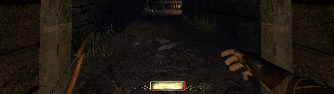
Trying to load image X from frontend, deferring...
in TDM Tech Support
Posted · Edited by snatcher
Hmm not sure. I sometimes notice custom in-game dialogues cause a stutter. Audio file? Subtitles? Both? Don't know.
No need to do anything for me. I did my best to have the smallest footprint (while retaining quality) in all fronts.
Thanks!