Leaderboard


Popular Content
Showing content with the highest reputation on 04/04/23 in all areas
-
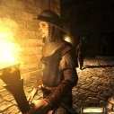
Market area and restaurant with the basic outside detail done. It was thankfully easy to create a colorized / toggleable version of the new lampion model: Only disadvantage is you don't see a light source inside which sucks a little, might end up using a flame like for candles later. The ones on strings swing which gives off a nice effect as the light moves around!4 points
-
I'm pretty sure we will change the formatting/layout soon. Existing messages would fit the new limits (they would be a bit larger), hopefully without exceptions. But the particular look will change, that's for sure. Your question is exactly why we should choose the new format as good as possible and fix it in stone afterwards.2 points
-
I have argued that the 2.10/2.11 implementations have field widths that are way too wide, unpopular with most subtitling orgs, and conflicting with TDM's corner inventory and weapon icons. So breaking backward compatibility now would be a good thing, before it's too late and too many FMs are subtitled targeting wide fields. But I can only suggest, and continue to make my bark subtitles fit in a less-wide field, taking into account sentence and phrasing breaks. Future automated text conversion update tools could be helpful.2 points
-
No, I have not, but was expecting that Dark Radiant also has further developed. I first wanted to update the game, before turning to DR. But thank you for the remonder.1 point
-
Also, I was interested in getting metadata about the TDM fonts. Some forum posts suggested you just rename a font's .dat file to .ttf, and then font tools (like those provided by FreeType) could read it. But all I'm seeing is an unrecognized file format when a read is attempted. ???1 point
-
@stgatilov, this is precisely where our views diverge. We're both interested in a narrower, aspect-corrected font, but for different reasons: You're looking to increase the amount of text than can be held... I'm looking to make the backing fieldwidth less wide, and think there's already too much text per subtitle. A possible compromise would be to make the fieldwidth 2/3rds of the screen. This would maintain the current amount of text, given the current font but now aspect-corrected. Probably more text (ugh) with the Stone font, aspect-corrected.1 point
-
@datiswous As I can tell, @stgatilov has been careful not to break backward compatibility with the 2.10 \ 2.11 subtitle implementations so I doubt you need to worry about wasting efforts. At the very least having the subtitles in "some text format" would allow us to use automated text conversion tools to update them if needed.1 point
-
Free version of the game: https://github.com/CleverRaven/Cataclysm-DDA1 point