Leaderboard


Popular Content
Showing content with the highest reputation on 11/02/21 in all areas
-
No more changes that I have immediately planned. I'm not clinging to any of the work I've done, so if you feel like improving them, please go ahead! I'm totally aware that doing stuff in pixels is somewhat 1998 in terms of UI design, but I can't think of any other way to restrict the sizes. Same for the spin buttons, which look different on every system. I can see why some of the larger projects don't bother with cross-UI frameworks and just do their entire UI on their own in openGL, like Blender or Lightwave. Overall I'm fine with #ifdefs, let's hope we don't need dozens of them. Didn't spend much time on the buttons, just wanted to get something going. I can upload the small photoshop file I've used to create the arrows, if needed. I'm pretty sure the grey background is in a separate layer. It'd be nice if the whole icon set of DarkRadiant underwent a full revamp, revisiting every icon, such that style, colours, contrast are consistent, keeping dark and light UI mode in mind. At the moment it has a bit of a Frankenstein touch.3 points
-
Some of you who've been on the TDM discord know I was out of work last Winter, just putting in hrs for the developer portfolio. Currently I've been working a seasonal job to pay the bills and now I'm finally in my last week before I get bumped off. Things will be tight but I'm planning a long off period to make as much content as I can. Big plans in Unreal Engine as well as my most ambitious TDM collab yet! Never been so excited to be a stuck at home to pursue my life's work. With a lotta time and maybe some luck, I'm hoping to get enough art work done that I may start applying around to studios.2 points
-
Fantastic work Greebo! When you mentioned you were revamping the texture editor in DR, I had no idea it was going to be this in depth. This is nearing modeling app levels of accessibility and I know we've got a lot of mappers who are still purely working in the editor, vs making & importing meshes. Being able to skew UVs like that in a handy UI, is gonna be a godsend for people.2 points
-
Got a second model in-game! With regards to the Khopesh, I'd like to get it functional as both a dynamic physics object and something that can be used as a weapon for enemy AI. To do that, would I simply copy-paste all the entity properties from something like the existing scimitar?1 point
-
Zerg Rush provided us with a very good picture. After consultation with Greebo and Dragofer, I have decided to use it for the mission. Once again, thank you very much for your help, this really looks great! @Zerg Rush1 point
-
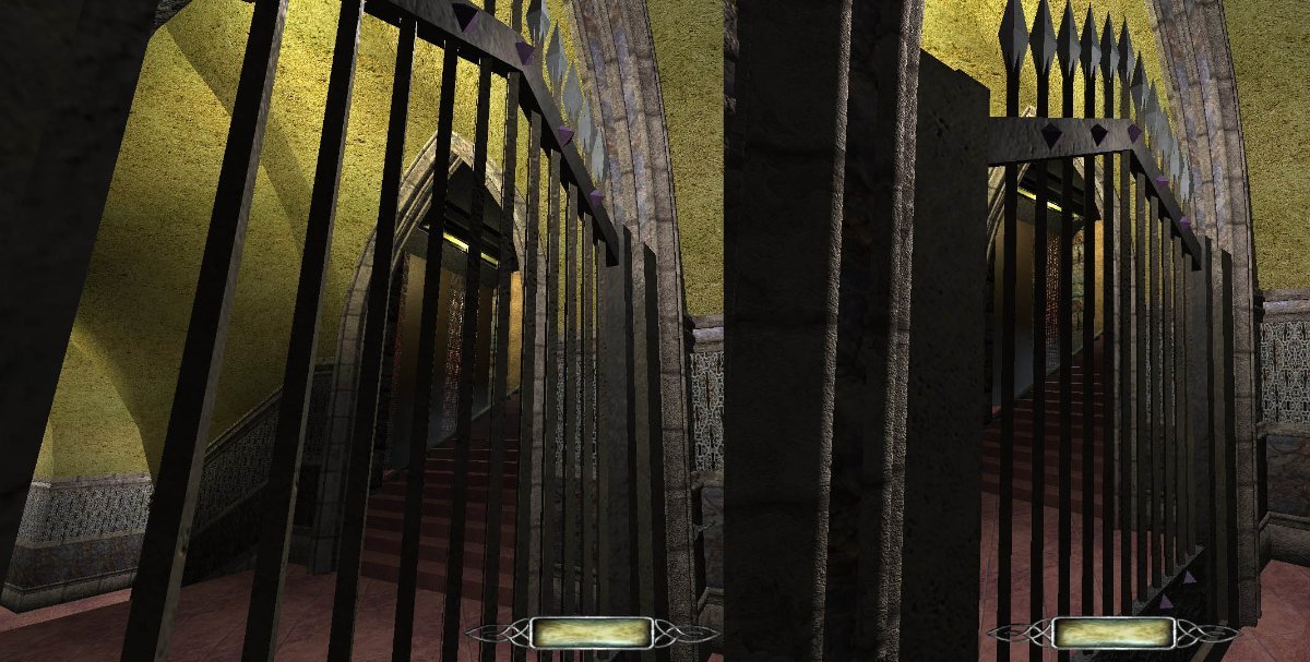
This portcullis is made with brushes only, no patches. You can see that the instance on the left where I made the brushes into an atdm:mover_door_sliding has broken geometry with seams in the spikes. The instance on the right follows AluminumHaste's advice to export as an ASE model, then import the model and change the properties from func_static to atdm:mover_door_sliding, then adding in all the required spawnargs (in my case: transparent /1 (since there's a visportal there), frobable /1, locked /1, translate /0 0 -176, used by whatever_key, snd_open /silence, snd_closed /silence, snd_move /door_metal01_move, ...). The geometry is clean on the model.
 1 point
 -
1 point
-
I finally got around to play Prey and I truly loved it. It is an incredible homage to System Shock and Deus Ex. While the gameplay is not en par with those two titles, the game makes up for that with its well written lore and story. The whole "world" just feells so authentic and it features a ton of really god environmental story-telling. Recommended for every immersive sim fan, i.e., everyone on this forum.1 point
-
Great, that works fine now. Thanks for still supporting Win7. A shame about Python falling off already but eh, times they are a changin'. Anyway, I've played with the build for about an hour, mostly with the texturing stuff and I can't say I've found any issues yet. Great work! Your efforts are really appreciated.1 point
-
Daaamn, I know I've seen this mission too. But like you I cannot for the life of me remember if it's TDM or Thief.1 point
-
When I was a young man my father was so ignorant I could hardly stand to have him around. As I grew older I was amazed at how much the old man had learned in such a short time.1 point
-
So can somebody do some comparison sceenshots or explain what's special about this new method?1 point