Search the Community
Searched results for '/tags/forums/subtitle/' or tags 'forums/subtitle/q=/tags/forums/subtitle/&'.
-
Sadly, I'm not optimistic about ever seeing subtitle accommodations based on HUD preferences, or on user choices. Given all the dust that's been kicked in my face for wanting just auto-selected two-width subtitle boxes, even as a user option.
-
Yeah it would be cool to see some more detailed statistics and it’s a shame they aren’t really captured. Since we are talking about fan mission platforms, where players also make the content for the game, I feel like the best thing we’ve got is you can look at the number of content releases for the games. Keep in mind the graph counts campaigns as single missions - so for example NHAT and TBP both count as 1 mission. A good year for TDM has has approaching maybe 50% - mostly we’re 25-30%. https://www.ttlg.com/forums/showthread.php?t=152494 You could also look at the number of ratings thief missions get on https://www.thiefguild.com/ vs TDM ones, but that is pretty iffy in that you could chalk that up to more awareness of the site in the thief community than TDM Out of curiosity is there a reason a thief player can’t be a new player? I kind of think a player is a player and new players would be ones who are playing the dark mod who weren't? Is there disagreement the base of players most likely to pick up the game are fans of the thief games? They are certainly the most fruitful place to find feedback on the game beyond the sphere of this forum that I have seen. When we were trying to finish up SLL there was a lot of discussion on the forums about how long it had been since there was a release for the game. I am thankful that the stats show at least some stability over the years in terms of releases for TDM, but the trend for all of the games is decline. Not doing anything is a valid response if that’s what the devs want to do - it is not possible to provide evidence that any effort will slow that inertia. As a player and content maker I would just prefer trying to find feedback where it is offered from players who were willing to try the game but ultimately could not engage with it and see if there is anything that can be done within reason to ease them into the game. The game has a lot to offer imo. All those players are potential contributors - contributions in turn attract players - it’d be nice to see the cycle go on as long as it can.
-
Subtitle Edit ( https://www.nikse.dk/subtitleedit ) now has support for subtitle extraction via Whisper. See https://www.nikse.dk/subtitleedit/help#audio_to_text . This works well on Windows. In the extraction window you can download all the needed extra dependencies the first time you use it. After the generation of the srt files, you can use the editor to tweak the files, or move to a seperate editor of your choice (including texteditors). Aperantly it also works under Linux: https://www.nikse.dk/subtitleedit/help#linux If it doesn't, see info above to use the commandline in Linux. Kdenlive ( https://kdenlive.org ) now also has Whisper subtitle extraction build in. This works well in Windows, but I couldn't get it working in Linux. You have to go to Settings > Configure Kdenlive. Then go to section Speech to text. On top of the window you select option Whisper. Then you have to install some stuff by clicking on an install button (this doesn't work in Linux currently). The extraction via cpu is considered slow, but I thought it's not so bad using an 8th generation i3 processor during a test with a large speech file. You can afaik only do this one by one, so it's not as fast.
-
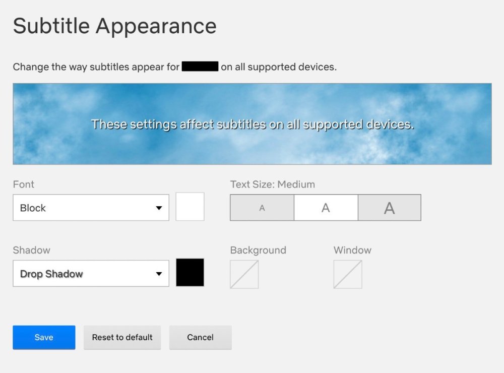
My two cents here is to mimic video streaming services, such as Netflix. They've likely spent a lot of time and money researching subtitles. The Netflix default is a white font color with a black drop shadow. In the subtitle settings, users can change the font color and enable/disable a background color. We could do the same and provide settings in the menu. The improvements to both the subtitles and location ring are looking good! Netflix settings:
-
I think this doesn't looks very nice. I think it's best to make the background the same width as the subtitle block. What do others think? Are we going for the background look, or are we going for the black outline? It's not clear to me what the current direction is, but the outline looks nicer and it seems a waste to try to implement something that doesn't get chosen anyway.
-
reduced height of the box & text from 45 to 37, while moving everything up by 9 points location ring moved up by 2 points added background field to location ring distance between subtitles reduced from 55 to 52 (50 makes location ring merge with next subtitle box) tdm_subtitles_message.gui
(1008_8420.15107.58).thumb.jpg.1cfdfadb8aa9f5f8b662ad93152280d7.jpg)
-
Can you share a subtitle file with mixed regular, bold, italic, colors... such as the above example so that I can see what you can see in my PC? The ugliest the subs the merrier
-
Colored text shows normally like this: But with Snatcher's subtitle look the colored subtitles look now extremely bolted: I guess this does make it more useful for emphasis, but a little less bolting would be better.
(1184_5558.55100.25).thumb.jpg.906123c16f62de6cff867568c906c978.jpg)
(1176.12549.53101.31).thumb.jpg.2ef48f9f20e73d7d805eb75e08f70aa4.jpg)
-
Replaced in svn rev 16896. The 20 pixel padding was introduce conservatively before the font was changed. Merely applying the 16:9 vs 4:3 correction allows to reduce it to 15. But also the font is significantly smaller now. I tried to edit text in order to see maximum overflow. It seems that capital W is the widest letter in this font, and I can't get a significant overflow (see image below). So I have reduced padding from 20 to 10. Also I shifted everything to the right, so that now subtitle ring and text field are centered horizontally (instead of the background box being centered). This looks much better with frobhelper activated, because previously frobhelper and location ring center we not at the same X position. Finally, I have increased step between subtitles from 50 to 55 to avoid next subtitle box overlapping with previous subtitle location ring. These tweaks can still be changed, since they don't change anything regarding the text layout. Here is how it looks now (blue background shows the text box): My stance on this is still the same: if large empty boxes look ugly, then we can make several possible background boxes and make engine select the best one that text fits into. This way the decision of which box is OK can be made with the very same code that actually renders this text, instead of some external independent computation. There is no reason why smaller background box should be applied depending on verbosity, except that "it looks all non-story subtitles are small enough now". One exception is enough to break this idea. Alternatively, it is quite possible that we switch from background boxes to black outline around text. Both approaches works rather well, and without background we can forget about tweaking the background box. tdm_subtitles_message.gui
(-375.6-320_8263.98).thumb.jpg.d249d0b71f3737baab45dae898239157.jpg)
-
I have been quite careful to ensure that making the subtitles narrower for barks (but not story verbosity) is not potentially breaking. Examples of this treatment have been included in all my more recent testSubtitles... releases. Yes, this is "crucial" for me. Regarding the padding issue, to restate: TDM 2.11 and on through the 2.12 released beta version use a subtitle right text padding of 20 px. While some padding is necessary, this does a poor job of centering the text visually in the backing field. This is obvious with a short bark. My redo of this, with padding of 7.5px on both sides, fixes it, while I believe not causing any problems for word wrap of subtitles with the given compressed font & scale. I'm provided several versions above of this fix (code hidden as Spoiler). Most recently, this was with snatcher's suggested tabbed location ring and vertically-tighter backing field, here This version will also be incorporated into testSubtitlesDrunk, to be released tomorrow just released. I would urge you to incorporate this code (or a close variant) into the next beta release.
-
Fan Mission: Cleighmoor (by grayman) (2014/3/1)
datiswous replied to grayman's topic in Fan Missions
I made Subtitle files with help of Whisper. This uses only srt files. No inline subs. Edit: subtitles added to mission. -
I think it looks much better when included in the subtitle background block.
-
I dunno, it seems to me that if you're not going to show the ring widget (because, say, it's the narrator talking, so second parameter SUBTITLE_SPATIALIZED is false), you shouldn't show the tab it sits on either. About the red dot location. I understand what you are saying about perspective earlier, but that might have been more apt when the ring had a thicker lower edge. As it is, I tested by first facing the sound source, then turning 180 degrees. I expect the red dot to be about the same distance from the ring perimeter... that's why I tweaked by 0.5 px Hmm, maybe we should at least try to get subtitle font color among the possible CVars. That is probably the least controversial. I see the choice as either to be fully flexible (triplet for RGB) or, easier for the user, just a boolean (white vs yellow). Either would work for me. You guys? BTW, it is possible to markup particular words in the subtitle with a primary color, for emphasis. @datiswous, you asked about this a while ago. Did you actually apply it to any game FM? The 2 obvious colors for emphasis are red and yellow. A yellow emphasis would be lost if all the text was yellow. Another potential problem: if the fake drop shadows were an option, then the markup would also override the black shadow with color, leading to the emphasized word becoming an unreadable blob. (This could be resolved by the engine providing a second version of the text string, stripped of markup.) Otherwise, maybe a policy for subtitlers: "no markup on subtitles"
-
I could move the text down 1 pixel more, but then the text descenders don't have much to breathe. The overall problem is that the bottom-most subtitle slot, if moved further down, begins to conflict too much with other HUD items. For wider story subtitles, this is the corner inventory and weapon items. For all subtitle types, it is the lower informational messages that can appear above the breathe bar. Keep in mind that all these conflicting HUD elements can be enlarged at user discretion through Settings. One solution is to have the engine change the order in which it fills empty subtitle slots. Currently it is: 0 (lowest), 1, 2. If instead it did either of these policies: Fill order: 1, 2, 0 for all subtitle types; or Fill order: 1, 2, 0 for story subtitles. 0, 1, 2 for non-story subtitles Then the frequency of conflict would be significantly lessened - particularly with (1) - since having 3 subtitles shown at the same time is rare. With a revised policy, the backing fields could be made taller, allowing more widget room, with slot 0 (and slot 1 to a lesser extend) lowered
-
Creating a new thread for this as it was being discussed in an old beta-testing thread starting here: https://forums.thedarkmod.com/index.php?/topic/21822-beta-testing-high-expectations/&do=findComment&comment=490751 I suppose the main questions are: when should this spawnarg be used, if at all? why was it introduced in the first place? Can we get it documented properly on the Wiki so misuse isn't propagated? @stgatilov @Dragofer
-
I think the positioning circle should be part of the subtitle block, not positioned above it. There should be enough space left above the subtitle block with background to include it.
-
I wonder if you could test 9x versus 4x-diagonals and 4x-non-diagonals? Maybe the extra 5 renders don't add much. There probably is some minor performance effect. I think you're still showing the widget too high, so it seems to be associated with the wrong subtitle. I prefer @stgatilov's original vertical positioning, even though it pushes the widget's lower edge against the top of the caption lettering. I wasn't sure what you where trying to point out as a problem... was it the word wrap? Yeah, the automatic word wrap with centered text can look ugly at times. An FM author can choose to insert a manual line break in that case. I do that routinely all the time for barks. Since padding is part of the background box, sure. It occurs to me now that maybe, to improve the appearance of text centering, the background box should also have equal-size padding on the left. That is, the location and size of the inner box is unchanged, but the outer box is wider and its origin shifted left, so the inner box is centered horizontally within. The padding can certainly be made smaller. I imagine the seed value of 17px was for a worse-case character like "W", that was then rounded up to 20. We could shrink it by: - choosing the seed character as the widest that might actually be at the end of a line followed by space to cause word wrap. Probably "w" or "A". - not rounding up - scaling by the compression aspect ratio I'll try to come up with a new number. No problem here with having the background by default. But recognize there's a compromise between world visibility and text readability. Can't we make it possible to turn the background off for people who hate it so much that they avoid using subtitles because of it? "...visible in all circumstances" may be too high a bar. The simple implementation would be a single CVar that toggles the background on/off and possibly, conversely toggles fake drop shadows off/on.
-
Yes, the backing field shown, while narrower, is still a fixed width for all bark texts, so still wider than ideal for that particular phrase. The width is the minimum needed to safely accommodate subtitle lines up to 42 characters long of 12 pt Stone font.
-
True. It would require a modification of the engine code. Earlier this year I wrote two experimental C++ utility programs that do the required calculation, for respectively 12 pt Carleton and (scaled to 12 pt) Stone fonts. However, others have expressed distaste, on complexity grounds, to having variable-width backing fields, so I've since been restricting my advocacy to a narrower fixed-width backing field for speech-verbosity subtitles. This outlining isn't really visible in your screen shots; and I'd like to see various color-tone game locations too. I see you use the "bordercolor" attribute for your outlining. I vaguely recall there was some circa-2010 TDM "drop shadow" experiments with (I'm guessing) using this for subtitling, with the Carleton font then in use. (This was before I got involved in subtitling.) Same conclusion: a bit problematic with the given font. So that led to the translucent backing field as an reasonable approach. It would be possible to add a new unicolor font just for subtitles to TDM. There is a roadmap for this, but it's a major project, so TDM 2.13? Agreed. That was part of my motivation for wishing to narrow the width of the backing field. I'm in favor of having settings to let players have more flexibility in the subtitle presentation. That would include font color.
-
Just too small a gap currently between blocks, to not overlap with something. I think it's better to overlap with the subtitle it's associated with, rather than the one above. The gap could be enlarged, but then 3rd topmost block would be close to screen center vertically, blocking more of the general view. Oval could be further shrunk, but becomes less informative. I guess, with tricky programming, you could suppress the ovals when there are more than 1 blocks shown. Probably no perfect answer.
-
Well it should be placed above the subtitle block if possible, I think.
-
Looking at the code, the originals were "pm_mantle_pull 750" and "pm_mantle_pullFast 450". The new "pm_mantle_pull" value is "400". A "pm_mantle_pullFast" value of "450" would be slower than regular pull, not faster. With both being set to "400", they are at least similar. Other than that, it's subjective and the feedback from playtesters was positive. Also, referenced internally here: https://forums.thedarkmod.com/index.php?/topic/22256-movementcontrols-settings-in-main-menu/&do=findComment&comment=489158
-
Btw. there's a subtitles folder, but the only subtitle is linked to a non existing sound file. Maybe that's ok, just mentioning.
-
That sort of tone doesn't fly in our forums.
-
I would use this massive list for any fan missions, it includes campaigns too: https://www.ttlg.com/forums/showthread.php?t=148090 There are a lot of Fan Missions for the picking, I myself go for the lesser known ones and the short variety, because sometimes they hide a gem or two. Just like jaxa, I'm a bit outdated after the temporal retirement, but I do remember some amazing campaigns like "The Black Frog". If you intend to play The Black Frog, you should play the first two of the L'Arsene series missions, it's how I did it myself. Also, yes, L'Arsene are a fantastic series. The first mission of L'Arsene is a "rough draft", author was a bit new to Thief level making, but still great either way, after the 3rd you will see how his skill increased by a massive amount.


(1008_8420.15107.58).jpg.d215015289174c9f02026278b8b1f154.jpg)

(1184_5558.55100.25).jpg.5c353ca6186028dfb9a2c8402716296a.jpg)
(1176.12549.53101.31).jpg.57260252b6b6a24934ffab196a92cc4d.jpg)
(-375.6-320_8263.98).jpg.ddad011d59760cc13750e1b43262e64f.jpg)