Search the Community
Searched results for '/tags/forums/black menu/' or tags 'forums/black menu/q=/tags/forums/black menu/&'.
-
I am not really invested in realism being the criteria for a how a game should play, but it sounds like the devs modeled it using actual parkour videos - which would be people mantling in real life. Even if it was desirable I am not sure “realism” is an achievable result. The capabilities of people in reality is pretty diverse after all. I think what you are describing as "realistic" is just what feels subjectively natural or correct to you, which you can and should advocate for that. I am speaking specifically about the “mantle roll” - the tilting camera animation which plays at the last stage of the mantle. What I found is that the new mantle kind of clicks and feels subjectively “right” to me with the revised speed is a setting of .5 instead of 1. But that’s just me, so curious if you or others have any opinion on this menu setting.
-
I think this doesn't looks very nice. I think it's best to make the background the same width as the subtitle block. What do others think? Are we going for the background look, or are we going for the black outline? It's not clear to me what the current direction is, but the outline looks nicer and it seems a waste to try to implement something that doesn't get chosen anyway.
-
Now that we have a solution to give text a black outline, I don't think there is any pressing need to make the background cap it's brightness below the text brightness. That said, I think the background still helps reduce the visual noise ( for example, if the text were rendering over stripes or dots of dark and light, brightly lit vegetation, etc ). I think we should have both the black outline and darkened background... and the background alpha should be bumped to 0.6 so it's a smidge darker to handle the worse case areas. Example: tdm_subtitles_message.gui.txt tdm_subtitles_common.gui.txt
-
So I encountered this weird thing. In fm The black Mage in the ingame-cutscene right after the intro-video the financial adviser (guy in red) doesn't have a position icon above all their subtitles: The black mage does:
(114.62646607.25).thumb.jpg.eda9a7a4e65e05b8aa713a2c3cdf6714.jpg)
(-41.38562627.25).thumb.jpg.c236a46a4be1ae318d87e0ca5de4794e.jpg)
-
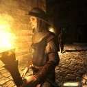
Whenever I eat fried chicken these days I think of this scene in The Black Mage..
(-41.38562627.25).thumb.jpg.3b0b9b11f58999322edab1d7ca5fb362.jpg)
-
-
 1
1
-
- Report
-
Incidentally, it's not entirely mine, I spun it together from quotes from a movie and a book and then integrated it into a setting that fits the Dark Mod.
-
-
 1
1
-
- Report
-
Replaced in svn rev 16896. The 20 pixel padding was introduce conservatively before the font was changed. Merely applying the 16:9 vs 4:3 correction allows to reduce it to 15. But also the font is significantly smaller now. I tried to edit text in order to see maximum overflow. It seems that capital W is the widest letter in this font, and I can't get a significant overflow (see image below). So I have reduced padding from 20 to 10. Also I shifted everything to the right, so that now subtitle ring and text field are centered horizontally (instead of the background box being centered). This looks much better with frobhelper activated, because previously frobhelper and location ring center we not at the same X position. Finally, I have increased step between subtitles from 50 to 55 to avoid next subtitle box overlapping with previous subtitle location ring. These tweaks can still be changed, since they don't change anything regarding the text layout. Here is how it looks now (blue background shows the text box): My stance on this is still the same: if large empty boxes look ugly, then we can make several possible background boxes and make engine select the best one that text fits into. This way the decision of which box is OK can be made with the very same code that actually renders this text, instead of some external independent computation. There is no reason why smaller background box should be applied depending on verbosity, except that "it looks all non-story subtitles are small enough now". One exception is enough to break this idea. Alternatively, it is quite possible that we switch from background boxes to black outline around text. Both approaches works rather well, and without background we can forget about tweaking the background box. tdm_subtitles_message.gui
(-375.6-320_8263.98).thumb.jpg.d249d0b71f3737baab45dae898239157.jpg)
-
I've got myself a 32:9 monitor and because of how text-heavy these games are it was almost unplayable to go on reading text all the way from my left to my right. I'm an engine programmer by trade so I set out to fix this and wanted to share my results. This fix will center the UI for any resolution wider than 16:9. For resolution that are more square i.e. 4:3 and 5:4 the UI will be anchored to the bottom instead as having the bottom elements floating in the middle looks strange. I also had to employ a trick to make some fullscreen effects stay fullscreen instead of becoming letterboxed, such as the transparent black backgrounds when reading books. Any rect that is 0,0,640,480 or larger will be considered fullscreen and stretch as normal. Of course some are note supposed to stretch like the custom main menu backgrounds so I added a bool variable for windowDefs called aspectAware that can be set to override this behavior. I experimented doing the opposite but could never find out how to make the book backgrounds stretch so I went with this. Still haven't figured out how to position the compass correctly but it looks decent enough.
(3265_8630.14140.25).thumb.jpg.c86185739962a36f96096cd2860fb10b.jpg)
(3272.21-1038_8168.25).thumb.jpg.b7f38b0e607ff0712a8684e0f58927e8.jpg)
-
I've just gotten through the pump house and experienced a system hang while I had to ctrl-alt-del and end the darkmod process to get any use from my computer. I will restart it and try again soon. edit: got further, having trouble finding the key for door 7C. clues/location? I needed to look more closely in Later I had a strange experience in room 11, coming down the ladder to the East side: I pressed Esc to bring up the menu, but only the cursor appeared; I didn't see menu options of hear and clanks like the cursor passed over them. Quickloading and trying again let me open the menu, but it was weird.
-
The Lord of the Rings, The Return of the King won an absurd amount of Oscars as a reward for a superb three-part movie ride. Thief: The Dark Project, The Black Parade deserves a similar treatment as the leading vehicle of 25 years worth of Fan Mission content.
-
I dunno, it seems to me that if you're not going to show the ring widget (because, say, it's the narrator talking, so second parameter SUBTITLE_SPATIALIZED is false), you shouldn't show the tab it sits on either. About the red dot location. I understand what you are saying about perspective earlier, but that might have been more apt when the ring had a thicker lower edge. As it is, I tested by first facing the sound source, then turning 180 degrees. I expect the red dot to be about the same distance from the ring perimeter... that's why I tweaked by 0.5 px Hmm, maybe we should at least try to get subtitle font color among the possible CVars. That is probably the least controversial. I see the choice as either to be fully flexible (triplet for RGB) or, easier for the user, just a boolean (white vs yellow). Either would work for me. You guys? BTW, it is possible to markup particular words in the subtitle with a primary color, for emphasis. @datiswous, you asked about this a while ago. Did you actually apply it to any game FM? The 2 obvious colors for emphasis are red and yellow. A yellow emphasis would be lost if all the text was yellow. Another potential problem: if the fake drop shadows were an option, then the markup would also override the black shadow with color, leading to the emphasized word becoming an unreadable blob. (This could be resolved by the engine providing a second version of the text string, stripped of markup.) Otherwise, maybe a policy for subtitlers: "no markup on subtitles"
-
the definition is just using backcolor set to all black with 50% alpha should be able to create a material with a translucent filter effect and replace backcolor with background /material/path
-
Creating a new thread for this as it was being discussed in an old beta-testing thread starting here: https://forums.thedarkmod.com/index.php?/topic/21822-beta-testing-high-expectations/&do=findComment&comment=490751 I suppose the main questions are: when should this spawnarg be used, if at all? why was it introduced in the first place? Can we get it documented properly on the Wiki so misuse isn't propagated? @stgatilov @Dragofer
-
One last chance! In the two mock-ups attached to this post I am printing out each block of text a total of 9 times. In my humble opinion this is as close as we can get to a true outline. 9 times may sound excessive but I recall very complex in-game digital screens with tons of text and graphics in Doom 3 and I assume my approach cannot hinder performance in any way. I can be wrong, though. Download a pk4 and place it in your TDM root folder. Do not use quicksaves/loads, start a new mission when switching pk4. Delete the pk4 once you are done with testing. Some missions to give this a go: Seeking Lady Leicester: Intro Braeden Church: Beginning The Black Mage: Intro + Beginning A New Job: Intro + whole mission Here is a comparison in extreme situations (better to experience it in-game because of image compression): Outlined white [z_Subs_212_NoBG_Yellow_v5.pk4]: Outlined yellow [z_Subs_212_NoBG_Yellow_v5.pk4]: And also attached the original, improved version [z_Subs_212_YesBG_Geep_v4.pk4]: z_Subs_212_NoBG_Yellow_v5.pk4 z_Subs_212_NoBG_White_v5.pk4 z_Subs_212_YesBG_Geep_v4.pk4
-
Yellow have an edge, yes. We definitely can't go wrong with white. Other than the graphic, which I think I cannot innovate further, I wanted @Geep to experience his work without backgrounds. To background or not to background, a tough call for different reasons explained. Fortunately this can be modded to an extent. I provided working samples. Download a zip, unzip it and place the "gui" folder in your TDM root. Delete the "gui" folder when you are done. No, I merely print the same text three times: 1x black a tad top-left, 1x black a tad bottom-right, 1x light grey centered. I think you better experience it for yourself, and draw your own conclusions.
-
I guess added sector is enough to drop the idea of more thickness on lower half of the ellipse. It is possible to expose colors of background and text to cvars. If the location ring image is black-and-white with varying alpha, then I suppose it should be possible to expose its color too (by modulating configurable color).
-
High FPS (160+) Slows Creep Footstep Timing
stgatilov replied to sullium's topic in TDM Tech Support
Maybe we should adjust menu setting to only include these "integer ms" values (while secretly settings com_maxfps between two consecutive ms values for reliability). -
Hi, I tried playing TDM on a 170 hz monitor but there seems to be a problem with the footstep noise rate and camera sway speed when creeping at very high framerates. I tried a few searches in this forum and couldn't find any posts about it so here goes. With the Max FPS setting at 150, creeping footstep noise and camera sway seem similar to capped 60 fps behavior, possibly a tiny bit faster. With Max FPS at 160 and then 166, the footsteps slow down such that creeping feels noticeably floaty. With Max FPS at 170, I've recorded a whopping 1 minute and 20 seconds between starting to creep and hearing the first footstep noise. The camera sway is slow and smooth enough that it is hard to notice at all. My specs: Windows 10 64 bit, Nvidia RTX 3060 Ti, Intel Core i7-13700KF. I'm playing on TDM 2.11 and have experienced this issue while testing both the Training Mission and Tears of St. Lucia. On a possibly related note, the "Max FPS" setting in found in the game's menu seems highly inaccurate. According to the game's own fps counter as well as my external counter, "Max FPS 180" actually caps the fps to 166, "Max FPS 200" actually caps fps to about 180, and so on. For this post I used the numbers shown in the game's menu, not the ones reported by the counter.
-
The Black Parade is Mod of the Year: https://www.moddb.com/groups/2023-mod-of-the-year-awards/features/players-choice-mod-of-the-year-2023
-
-
8
-
- Report
- Show previous comments 3 more
-

I think I hear some TDM music in the first mission

-

Well deserved to be honest.
-

Glad to see a Thief mod getting good exposure. Nice to know there's still an apatite for some good immersive sims yet.
-
I have assumed that, although there are models made, it is not a simple copy - paste, independent if it is from these repositories or stolen from other games. Regarding AI, it can be a good tool for certain assets, bad only if it is used as a shortcut to create a game and not just as another design tool. The AI tool listed, although it can be create other things, can be used very well to quickly create textures, for example, saving time in the game developement. AI also can be used to create classical paintings, much used in TDM, without any copyright problems, things like this, and maybe even better adapt to the plot as the same paintings used since several Years now, apart of the one I made for the Black Mage. It is clear that stealing designs from other creators is very ugly and certainly a bad path, which is why I have said that piracy is not necessary, with the free and open-use resources available. You surely have other sources of these, apart from the list What I put.
-
I think there was a quirk in the engine that treated pure 0 black as an artist error so a small uplift was added to ensure proper light response. This was more critical when the ambient had a Fresnel component. The DXT1 encoding was to save on storage. I think that's a silly rationale since a pure single color texture could technically be represented by a single pixel. No pressing need to compress that or even a 32x32 texture but I suppose if someone is obsessed with saving texture storage they could choose png or a better dxt version. TLDR; Transparent \ Blend textures should be fine with 0,0,0 color and single color textures don't need aggressive compression. _black should be fine for all such materials.
-
There are many uses of this texture, and all of them use this compression algorithm. Perhaps replace it with full black texture would be better, since it already works that way. I wonder why this texture was even created with (1, 1, 1)... //matt black - there are already blacks but cannot get _black nor bc_black to reference as diffusemap // NB: this texture still has default specular reflections. For complete black, use black_pure below textures/darkmod/sfx/black_matt { qer_editorimage textures/darkmod/sfx/black_matt_ed diffusemap textures/darkmod/sfx/black_matt } The original code comes from 2008. And there is also 4151, where black_pure and white_pure materials were added. I hope someone familiar with assets will help decide
-
This is caused by DXT1 compression of textures/darkmod/sfx/black_matt.tga. This image has constant color (1, 1, 1) everywhere, i.e. almost black. Previously, the image was compressed by OpenGL driver, so you could get different results depending on vendor. I got (0, 0, 0) everywhere, you probably got the same. But someone else on another vendor could get something else. Now, compression is done by our code, same for everyone. It compresses the color to (0, 1, 0). Obviously, this is a bit closer to (1, 1, 1) than (0, 0, 0) Notice that DXT1 uses 5 bits for red and blue but 6 bits for green. So while it is possible to represent 1/255 value for green, it is not possible to do the same for red and blue. However, this 1 tick adds a bit of green to the overly black picture, and then you apply huge gamma correction (basically take sqrt of all color components) and this green becomes noticeable. Some ways to fix the issue: Use _black texture. It is (0, 0, 0), and I am rather sure it will be compressed to (0, 0, 0) by all implementations. Modify textures/darkmod/sfx/black_matt to be full black (0, 0, 0). Add forceHighQuality to the stage which blends textures/darkmod/sfx/black_matt. Add DDS version of textures/darkmod/sfx/black_matt to core assets. Note that points 1, 2, 4 produce equivalent output, i.e. force texture to (0, 0, 0) color. Point 3 leaves the texture as (1, 1, 1), but there is no way to do this for all materials: the keyword has to be added to each material. Points 1 and 3 look bad because they fix the problem now, but don't stop the problem from happening again in the future.
-
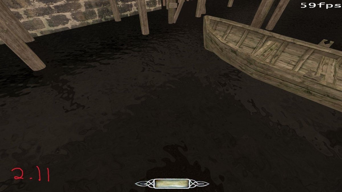
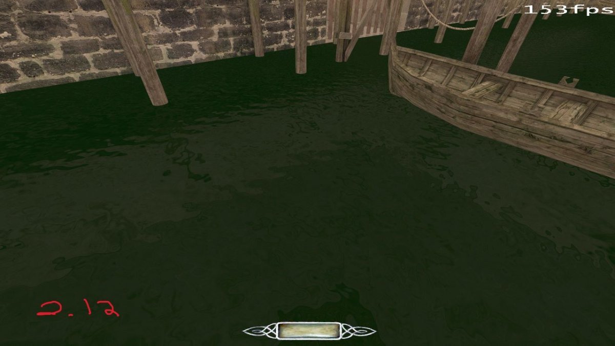
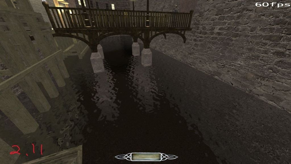
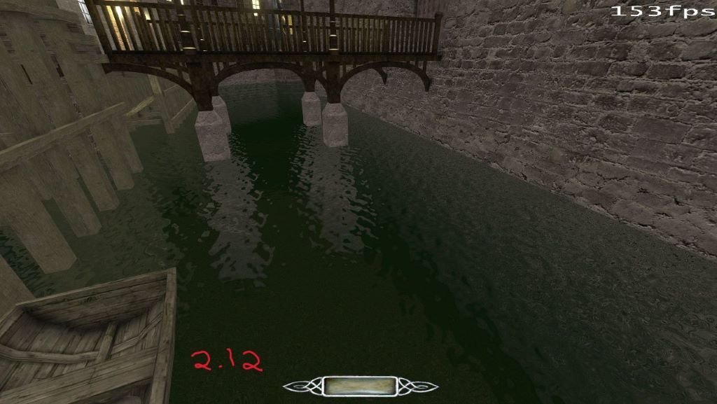
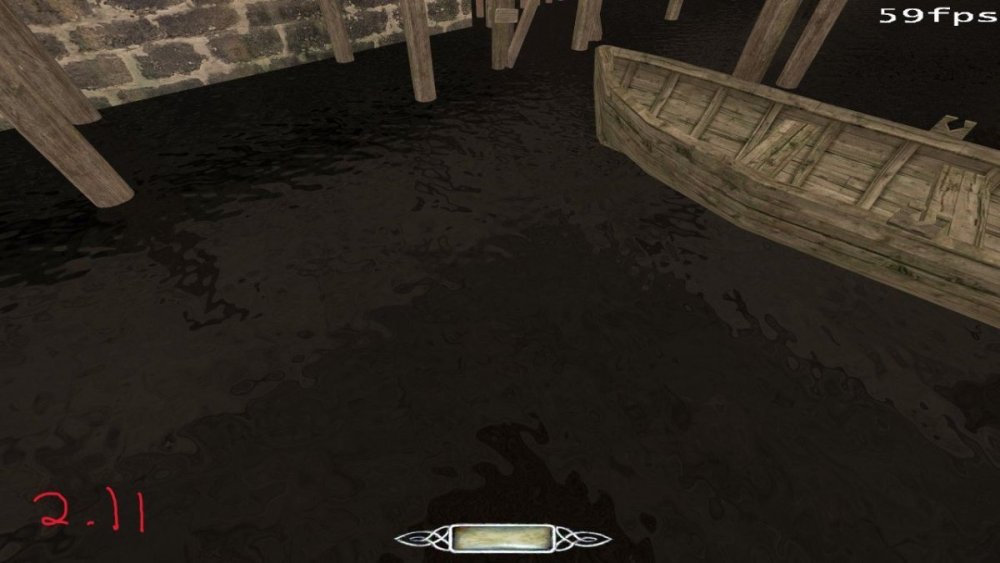
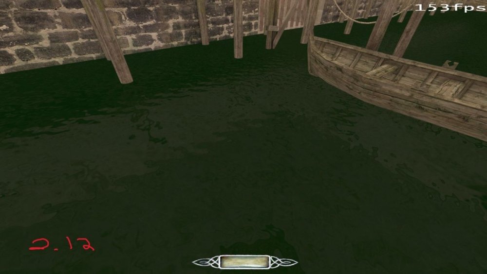
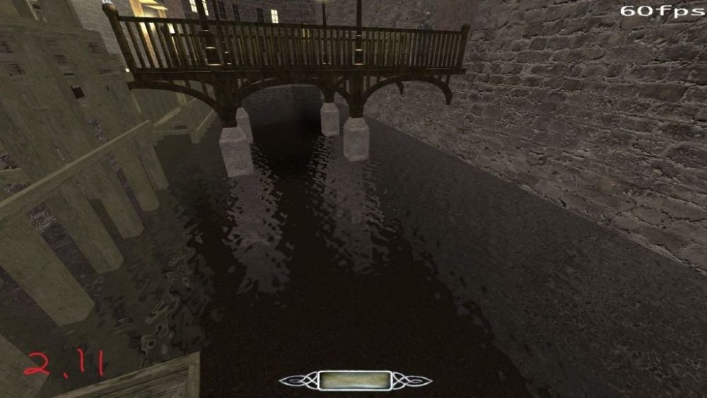
In High Expectations, I used a custom water material because I wanted a water surface that was dark and not entirely transparent. It looked pretty decent and I am using it in my next FM as well. However in 2.12 the water material has a greenish tinge to it (see attached screenshots). Here is the material - it's basically 'water_stream' with a blend stage using matt black: https://github.com/FrostSalamander/fsx/blob/main/materials/fs_water_stream_dark.mtr These screenshots have the brightness and gamma cranked up to maximum, because the difference is subtle (but noticeable) on normal levels and the screenshots were way too dark without it. High Expectations: WIP FM:

-
Not this time though, the campaign is getting some PC press coverage, some major outlets like Rock Paper Shotgun included: https://www.rockpapershotgun.com/the-black-parade-is-a-thief-mod-from-a-team-including-a-dev-at-arkane-and-an-original-thief-designer The TDM / cgtextures.com situation made me think though; maybe, instead of worrying what future license might include, there could be a steady effort to replace photo-sourced textures with hand-made / proc-gen ones? That list is huge, but the peace of mind in the end is priceless.
-
I saw and heard a lot of stuff in The Black Parade which definitely isn't OK for them to use... sounds and textures from Thief 3 and a lot of other games. Seems like they are not very particular with that stuff. As you mentioned, probably best to just ask them.
(114.62646607.25).jpg.87c61f25b5b9d176016bbdb7e990a205.jpg)
(-41.38562627.25).jpg.118bba9fe02833e9398d6de5880f7c6d.jpg)
(-41.38562627.25).jpg.908c9d7691411a7044dd49ba4a7f21ae.jpg)
(-375.6-320_8263.98).jpg.ddad011d59760cc13750e1b43262e64f.jpg)
(3265_8630.14140.25).jpg.7f418cafe2b3b0db7d23f28bbd41e818.jpg)
(3272.21-1038_8168.25).jpg.b0307e93b9d2387e162d295bec9c946f.jpg)